How to create dripping effect for editable text with Stipplism in Adobe Illustrator
9 minute readToday you will learn how to create a dripping text effect using the Symbol Stipple feature in Stipplism, Appearance panel and native Illustrator's feature.

Step 1
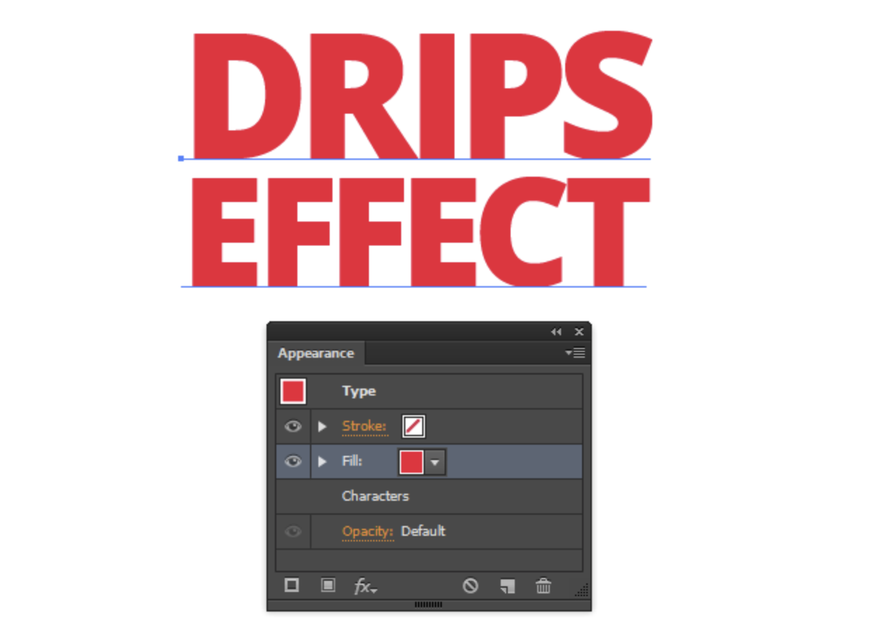
Take the Type Tool (T) and create arbitrary text, this is what we will be working with. For these purposes, I used Open Sans free font.

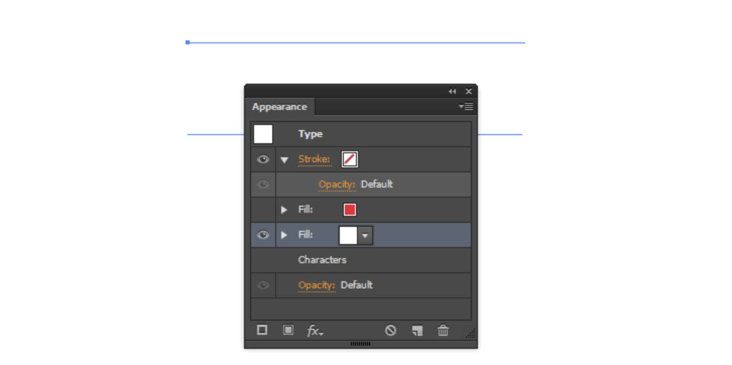
Turn off the fill for the text in the Tools panel and open the Appearance panel (Window > Appearance …).
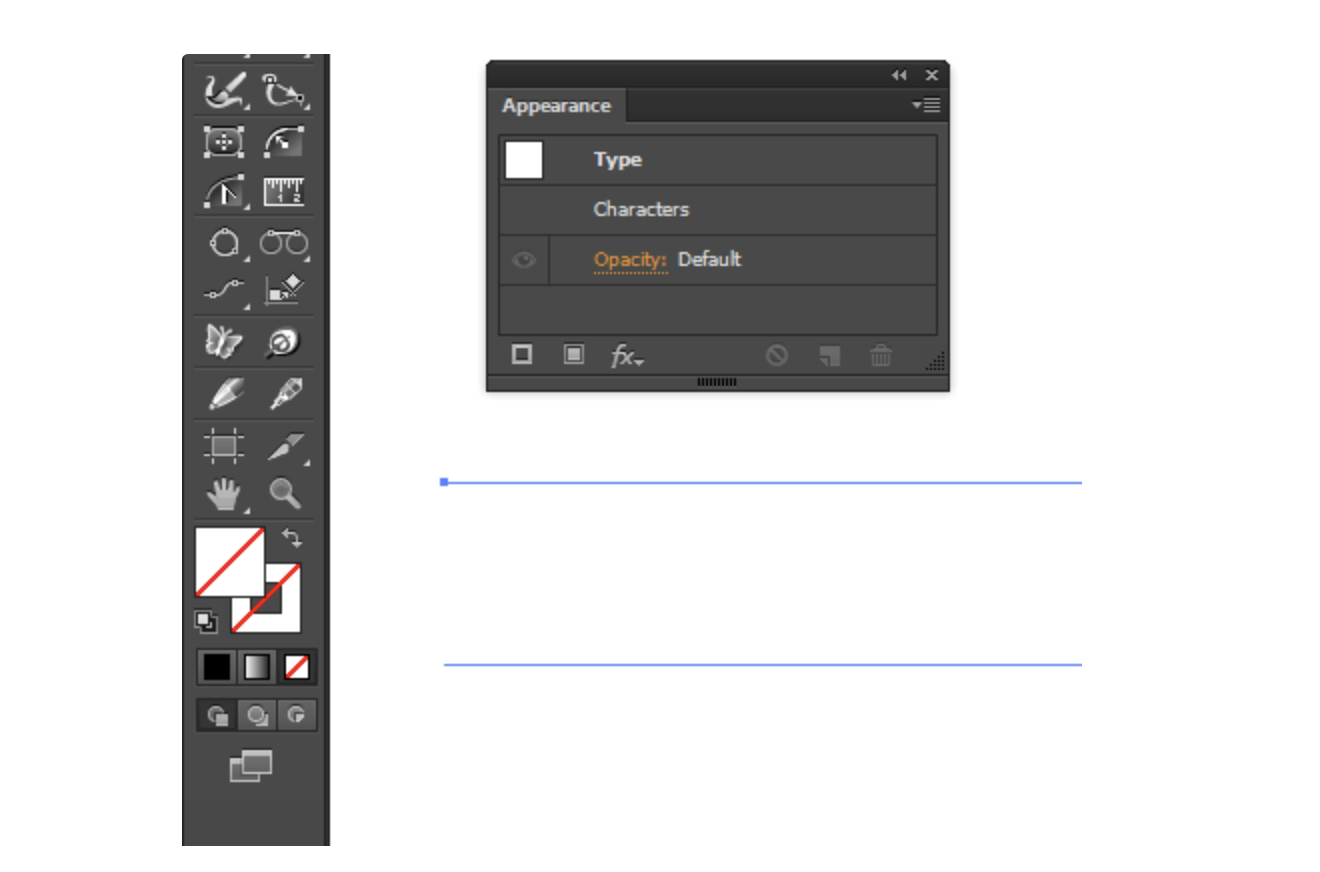
Add a new red fill in the Appearance panel.
Step 2
Create a few drops of different shapes that will be flowing down from the text. You can draw them with the Pencil Tool (N), or Dynamic Sketch Tool.

Add on some drops a few light pink glares and group up (Cmd / Ctrl + G) each glare with a drop on which it is located.

Step 3
Save any drop as a new symbol in the Symbols panel (Window > Symbols), in the opened dialog box select the upper central registration point.
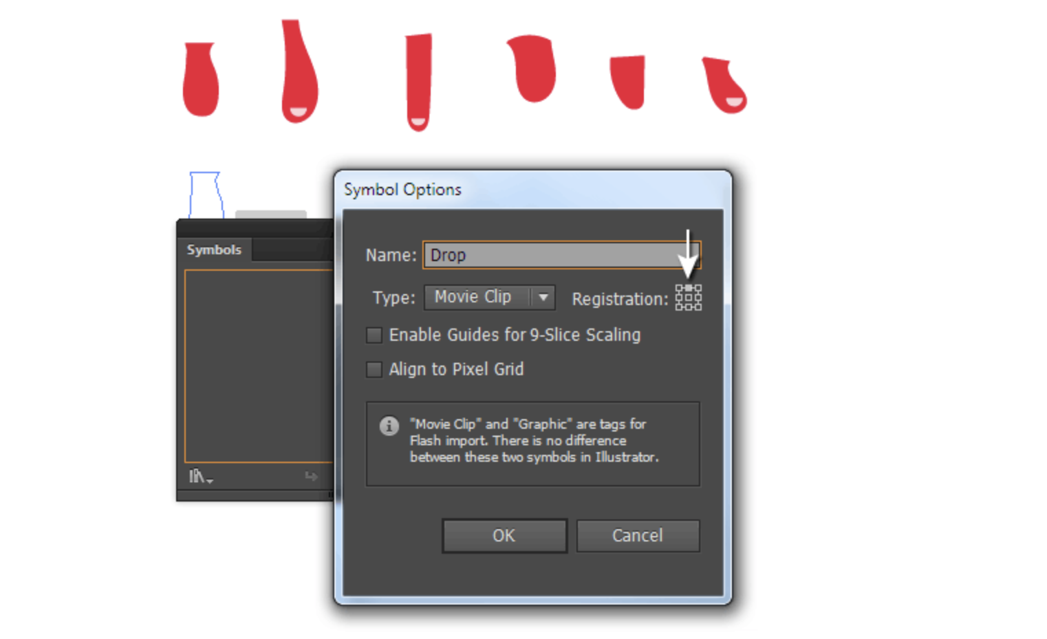
The remaining drops will be the variants of the first symbol. Select them, then go to Object > Create Symbol Variants…, select the desired base symbol from the drop-down list in the dialog box.
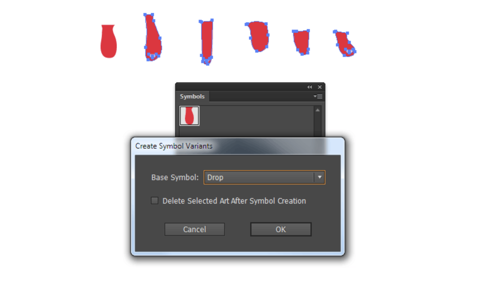
This feature is available to users of the Stipplism plugin, which we will use later in this tutorial.
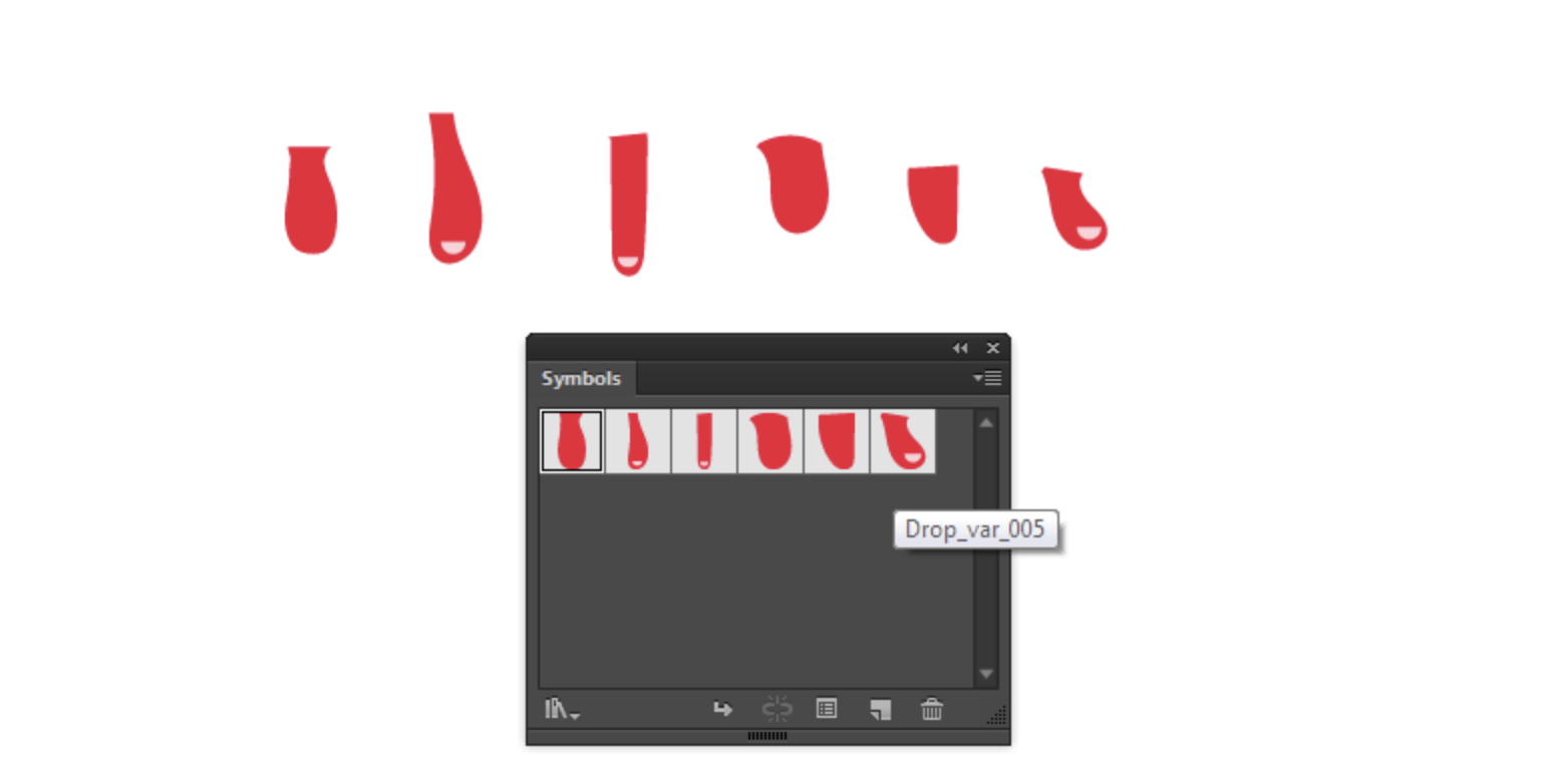
Step 4
Double click on the first version of the Drop symbol in the Symbols panel that will lead to switching in to its editing mode. Move the drop down so that the registration point is on top of it. The location of this point will determine from where the drop will begin.
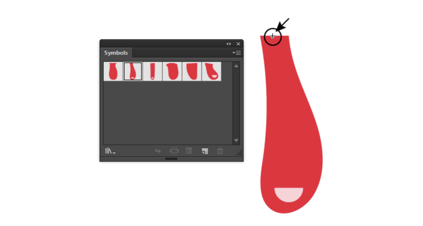
Do the same manipulation with the other versions of the symbol.
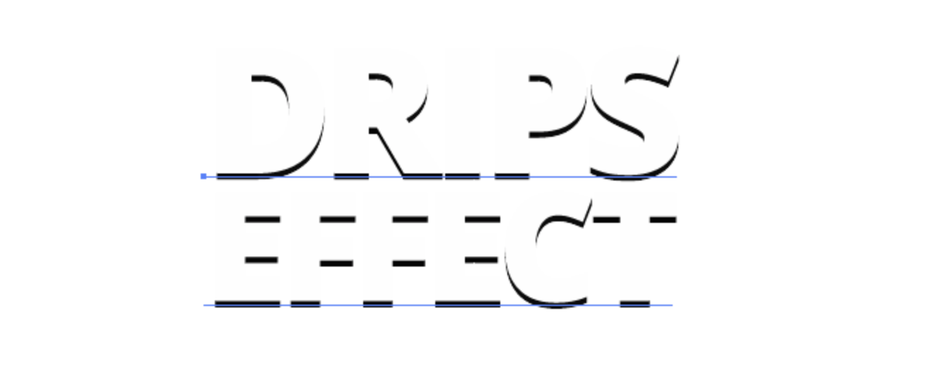
Step 5
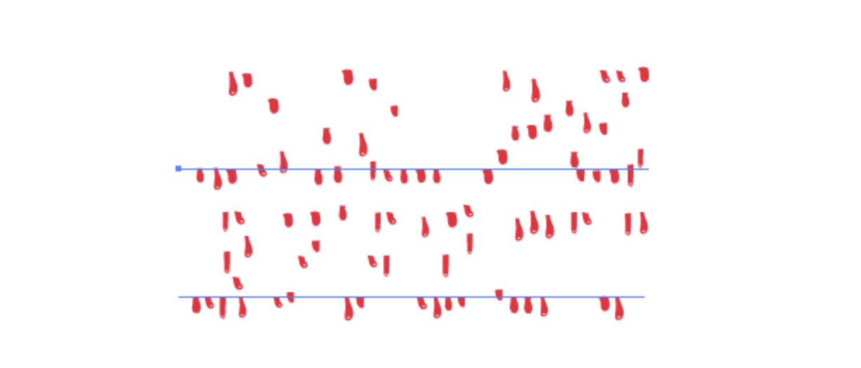
Let us return to our text. Drops should be dripping at places that are marked in black in the picture below.

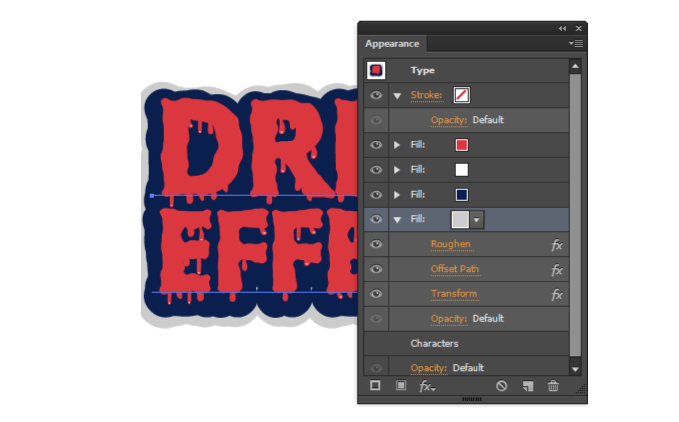
Create a white fill in the Appearance panel and place it below the red one. For clarity, temporarily disable the visibility of a red fill.
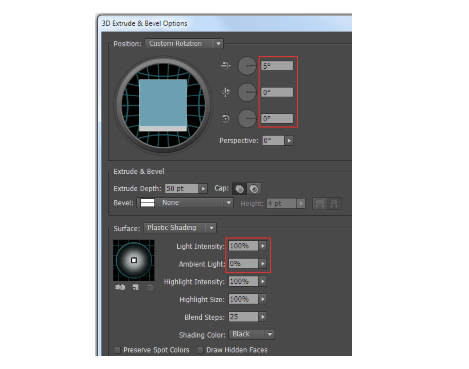
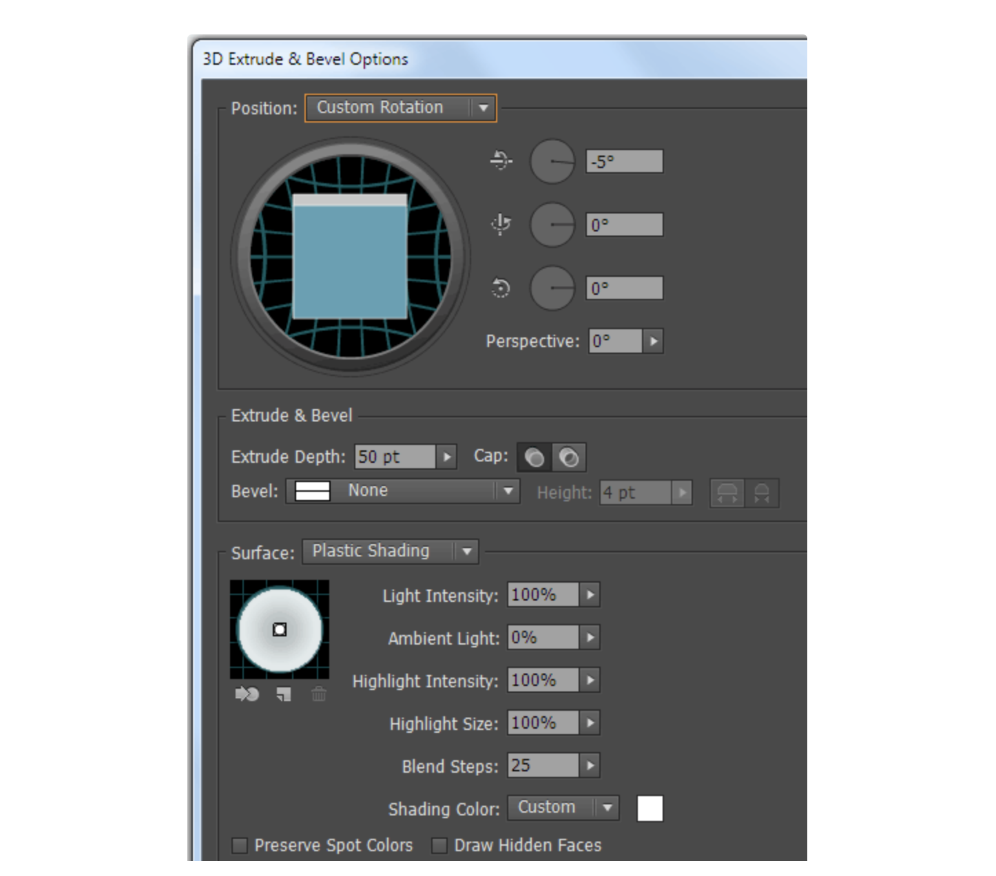
Select a white fill in the Appearance panel. Then go to Effect > 3D > Extrude & Bevel… and set the parameters shown in the picture below.
Step 6
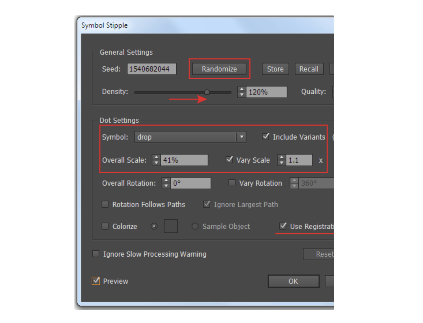
Replace the black areas with drops with the help of Stipplism. Keeping the white fill selected, go to Effect > Stipplism > Symbol Stipple…. In the opened dialog box I increased the value of Density and Quality, which is responsible for the amount of drops and the accuracy of their distribution respectively. Randomize button will help you choose the drop distribution option from millions available. In the Dot Settings options there has to be selected our base symbol – Drop and the Include Variants option. I also reduced the value of the Overall Scale option, which affects the size of the drops and chose Vary Scale option, so that the drop size was changed within the specified ratio. Finally, select Use Registration Point in order to take into account the position of this point in the symbol and all of its variants.
Step 7
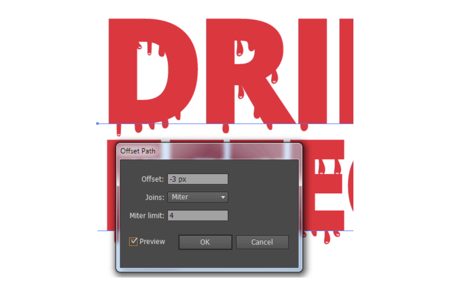
Let's turn on the red fill. As you can see, the drops start appearing a little farther than the outline of the letters.

Let's fix that. Select a white fill, then go to Effect > Path > Offset Path… and set the offset value inside the outline. Now drops are positioned correctly.
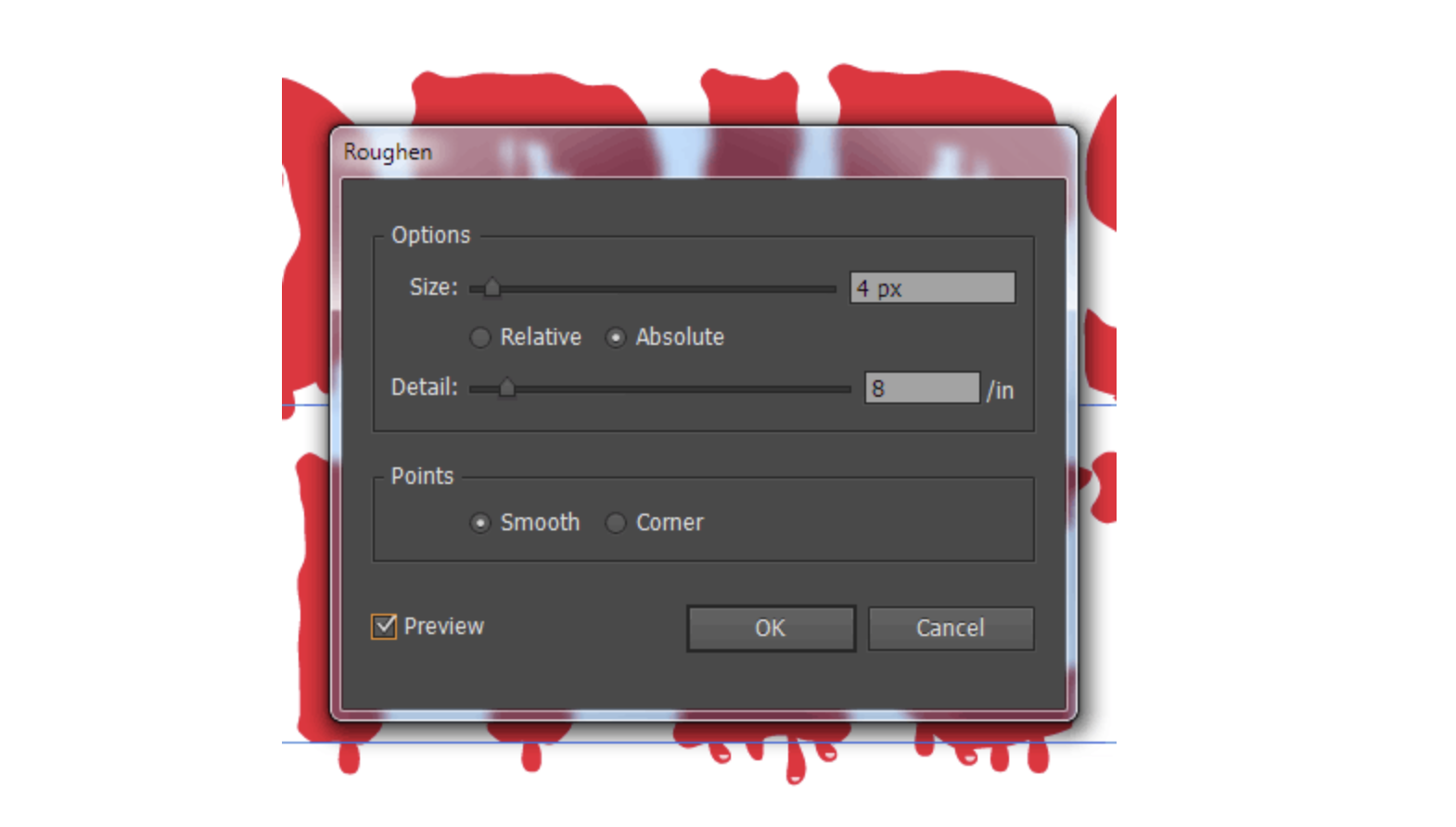
Select the red fill, then go to Effect > Transform & Distort > Roughen… and set the parameters shown below.
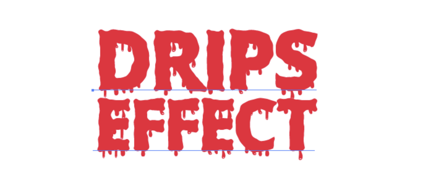
Dripping Text effect is obtained, you can save it as a style in the Graphic Style panel, and apply to another text, without having to repeat the entire sequence of the described actions.
Step 8
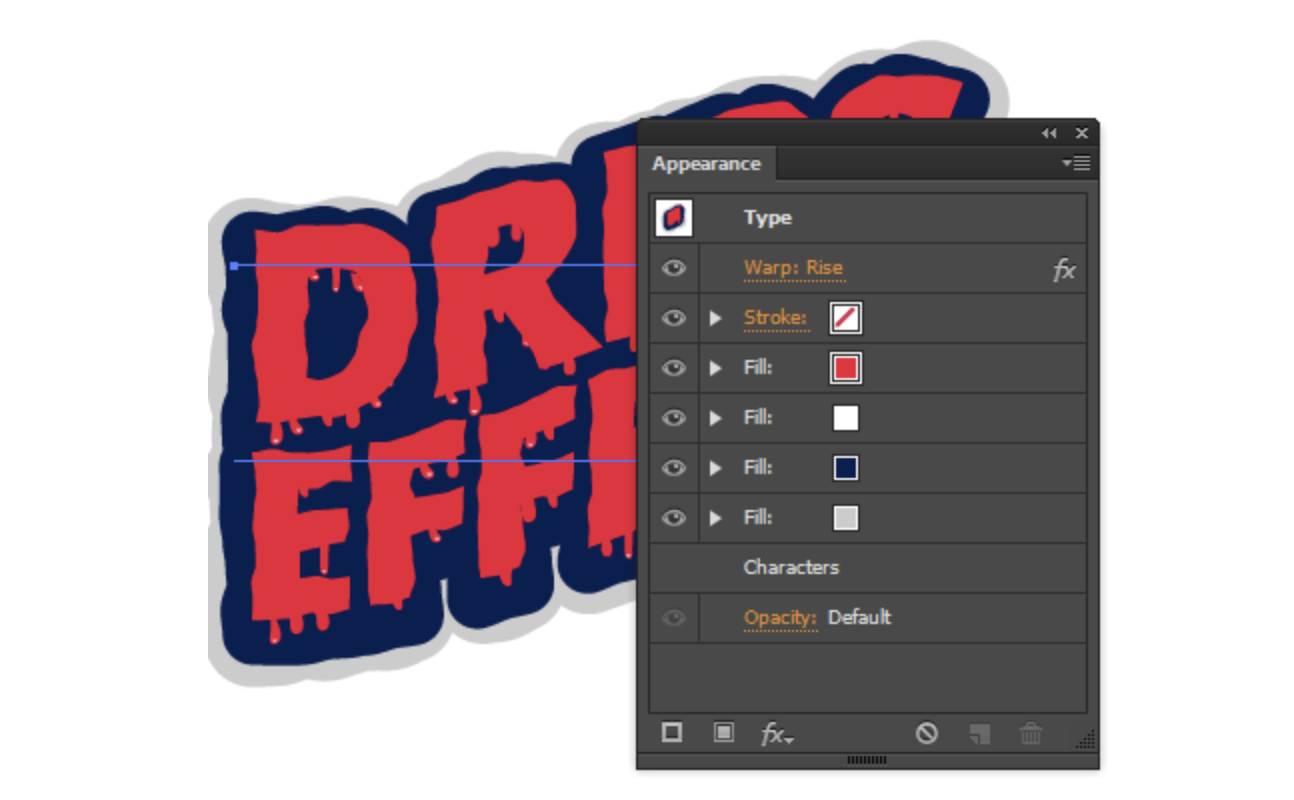
Although the main purpose of the tutorial is reached, we can continue working on the appearance of the text. I added the dark blue fill and applied the Roughen, Offset path and Transform (to slip a little down the fill) effects to it.
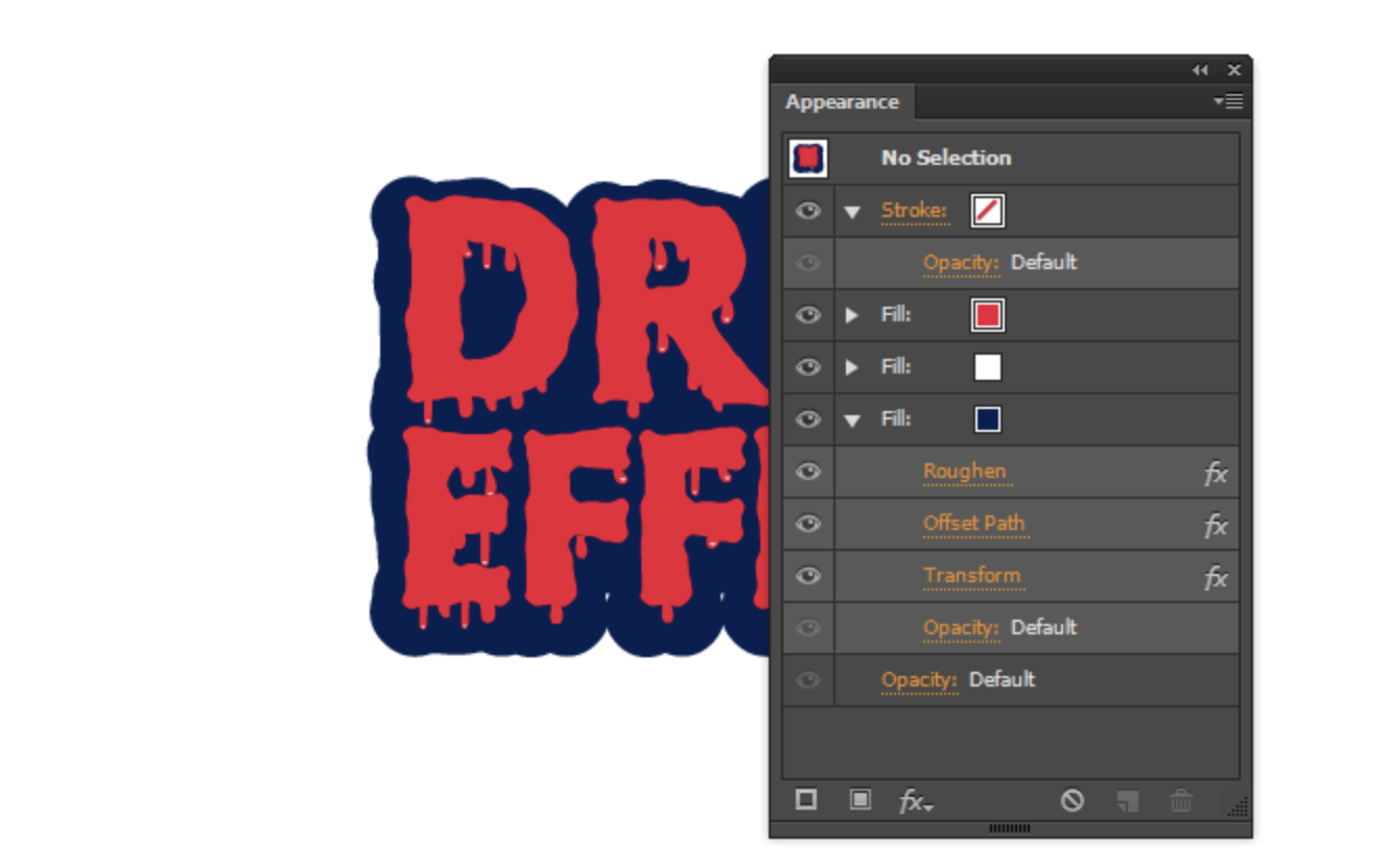
Then created a light grey fill with the same effects as in the blue fill, but with larger parameters.
I then applied the Rise effect (Effect > Warp > Rise…) to the entire text.
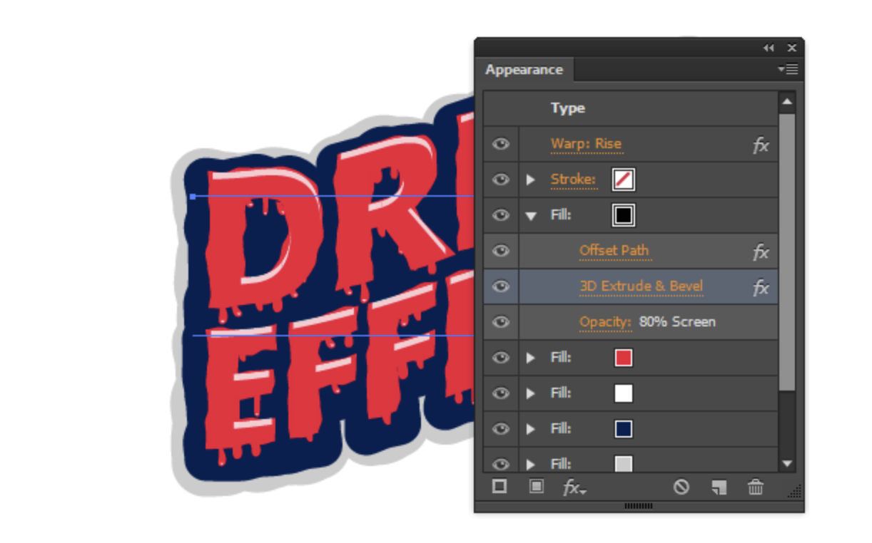
If you wish, you can add another fill, which will turn into glares using Extrude & Bevel effect.
That's it, now we have proved that we can trust Stipplism to do an accurate and intellectual piece of work – creating dripping text effect.