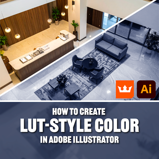
How to create LUT-Style color grading in Adobe Illustrator
7 minute readColor grading is usually associated with photography and video editing, but what if you want that same LUT-style color grading in Adobe Illustrator, directly on your vector artwork or embedded images?
This question was asked by one of our Slack community members:
I'm making a security screen and struggling to get more of a LUT look. Is there a way to do that with Duotone?
It was answered quickly by one of the community members. The Astute Graphics Slack Community is a great "Hub of Help" for anything Adobe Illustrator related. You can join and be part of the conversation using this link: https://bit.ly/ag-slack
👇 Skip ahead:
Is there a way to add a LUT look in Illustrator?
Most designers assume that Illustrator can’t grade visuals the way Photoshop or Premiere can. However, Astute Graphics’ Phantasm can create film-style color transformations right inside Illustrator, on both images and vector artwork.
In this guide, you’ll learn how to use Phantasm Tritone and Curves to achieve rich, LUT-inspired color tones without ever leaving Illustrator.
This tutorial is perfect for anyone who wants cinematic vector art, stylized illustration palettes, CCTV effect or unified color direction.
Phantasm works on:
Vector objects
Groups
Entire illustrations
Embedded images
Linked images (if you expand)
This makes it ideal for professional workflows where you combine vector shapes, textures, gradients, and photos in one file.
If you don’t have access to Phantasm, you can start a free trial for 7 days (no card details required).
In this tutorial we are using the Phantasm features as Live Effects, which means they are non-destructive and can be turned on/off after they’ve been applied. If you want to apply these features as Filters, or understand the difference between the two, you can find out more on the documentation website: Phantasm Live Effects Vs. Filters - What's the difference?
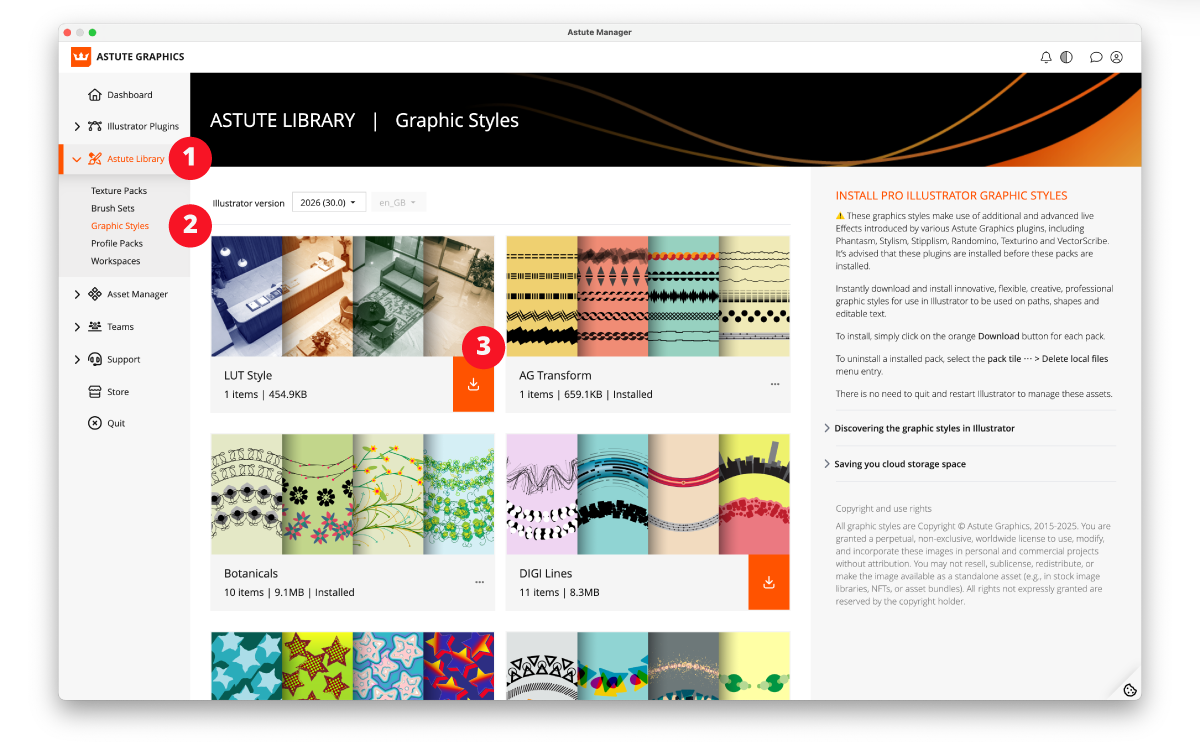
Download the Graphic Style pack from Astute Manager
If you want to start exploring right away, we've made these LUT-inspired live effects available as Graphic Styles. You can download the LUT Style Graphic Styles Pack from your Astute Manager directly into Adobe Illustrator. Anyone who uses the Astute Manager can access these packs for free. Astute Manager downloads and installs them directly into your Adobe Illustrator, making them available for every new project.
In Astute Manager, open the Astute Library sidebar menu.
Click on the Graphic Styles page.
Download the LUT Style pack directly into your Adobe Illustrator.
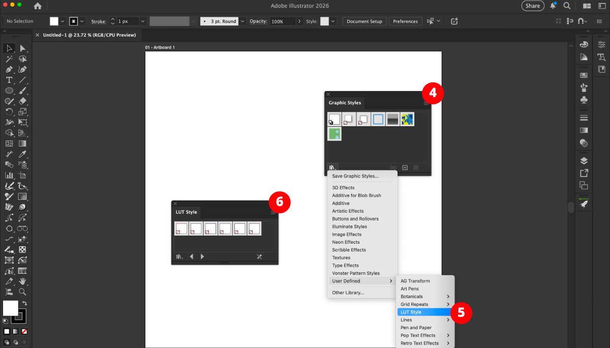
In Adobe Illustrator, open the Graphic Styles Panel (Window > Graphic Styles).
Using the Library Menu icon, navigate to User Defined > LUT Style.
The LUT Style Panel will open, giving you easy access to the 6 Graphic Styles.
Note: To apply these Graphic Styles without overwriting existing fill or stroke colors, hold down the Alt/Option key while clicking the pack.
How to add Phantasm Duotone for LUT-inspired looks
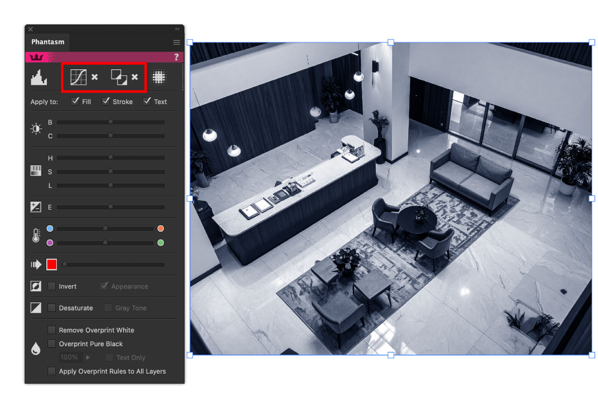
Once you have Phantasm installed inside Adobe Illustrator. You can find the Phantasm panel under Window > Astute Graphics > Phantasm.
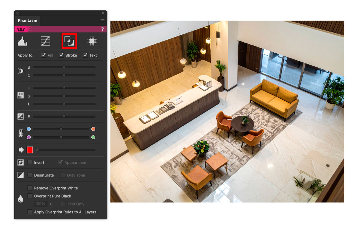
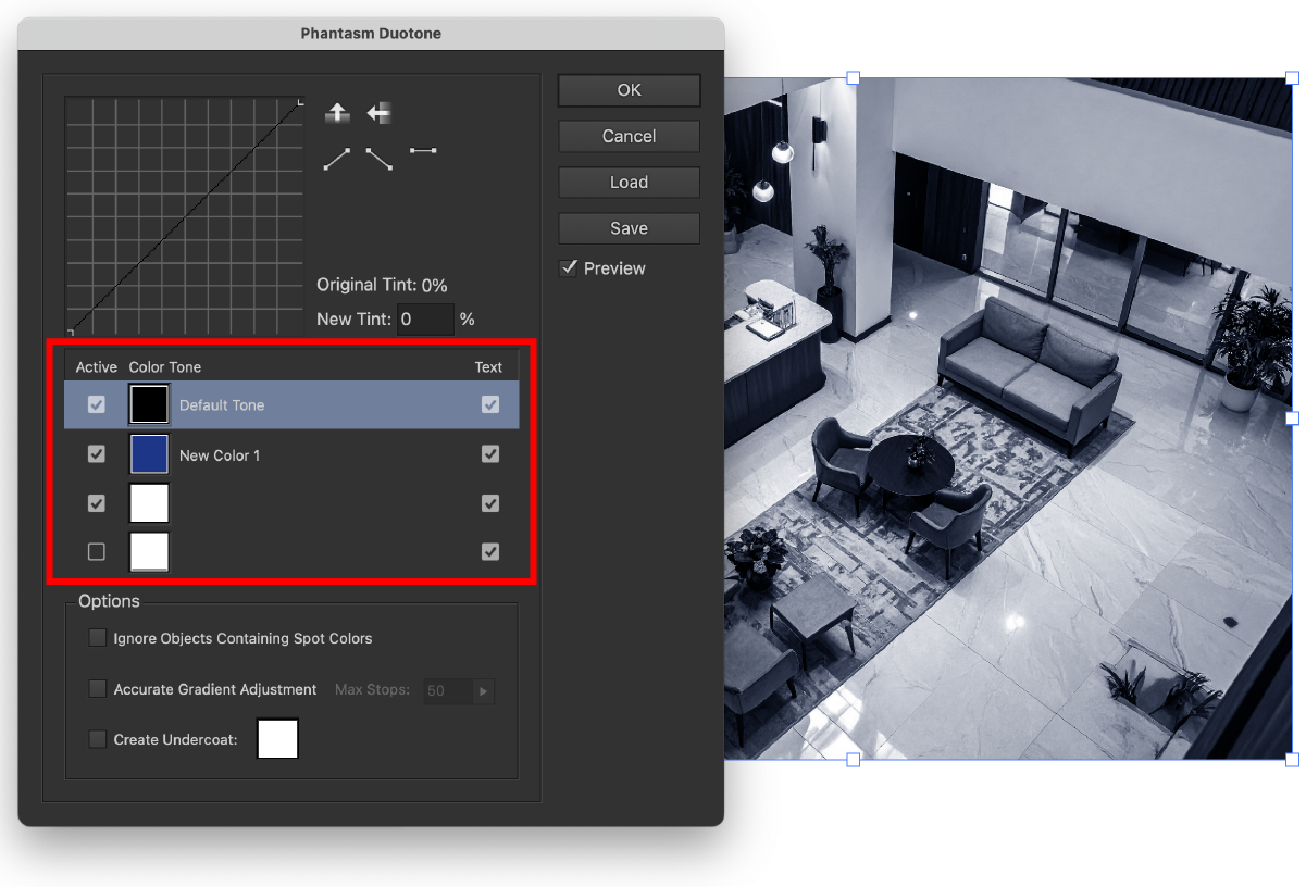
Click the Phantasm Duotone Live Effect Button, this will open a new dialog. This is where you can add more than one color from duotone, tritone, or quadtrone effects.
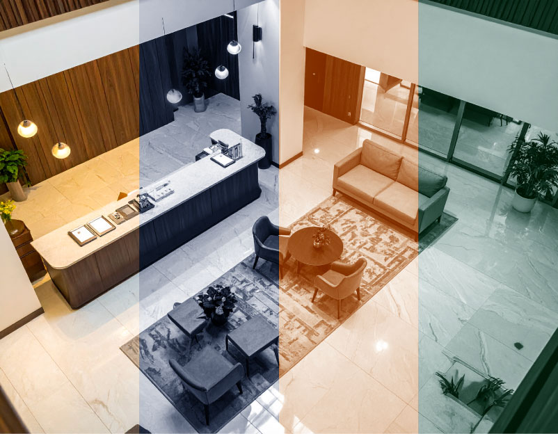
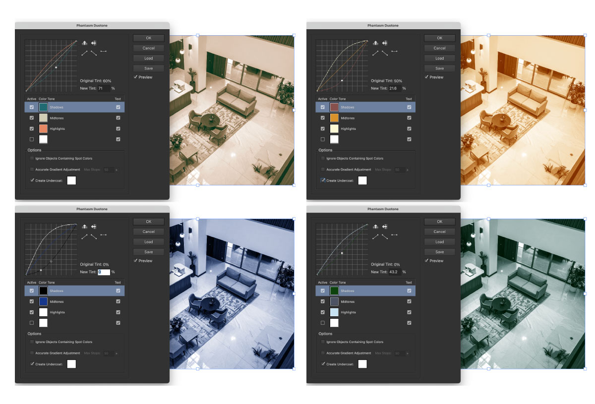
We will be using a tritone effect in this example. Tritone replaces shadows, midtones, and highlights with the chosen colors, delivering a hyper-controlled mood palette.
How to use Tritone for LUT-style grading:
a. Cinematic warm shadows + cool highlights
Shadows: deep teal
Midtones: neutral warm gray
Highlights: warm cream or peach
b. Retro film look
Shadows: muted maroon
Mids: dusty orange
Highlights: pale yellow
c. Horror / Thriller LUT
Shadows: green
Midtones: cold gray
Highlights: blue-white
d. Noir / Monochrome / CCTV LUT
Shadows: ultramarine
Midtones: desaturated navy
Highlights: light gray
You can find out all about this live effect with the Phantasm Duotone documentation: https://docs.astutegraphics.com/phantasm/duotone
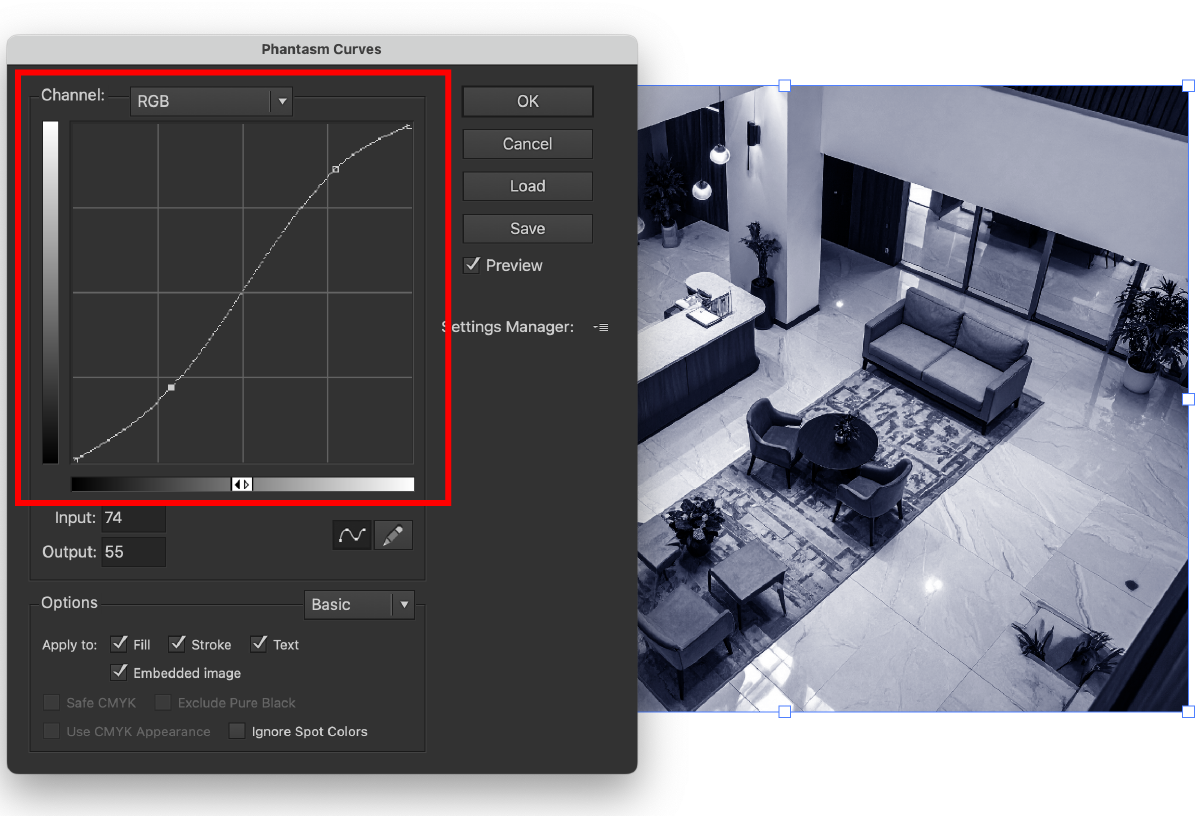
How to apply Phantasm Curves
You can find the Phantasm Curves Live Effect also on the Phantasm panel (Window > Astute Graphics > Phantasm).

Create an S-Curve for film-like contrast:
Pull down shadows slightly
Lift highlights
Keep midtones stable
This creates a cinematic, punchy contrast profile.
You can find out all about this live effect with the Phantasm Curves documentation: https://docs.astutegraphics.com/phantasm/curves
Now that both effects have been applied to the embedded image, the Phantasm panel displays a small Cross next to each effect. You can either click the button again to reopen the effect dialog to make further changes, or click the Cross to delete the effect. You can also use the Appearance panel (Window > Appearance) to view and edit the live effects.
Why use Phantasm from Astute Graphics?
This workflow brings professional-level color control to the vector world:
No raster export required
No jumping between software
Fully editable vectors remain intact
Consistent cinematic style across an entire brand or illustration series
Embedded photos and vectors can share the same palette
If you’ve ever wished Illustrator had a native way to apply LUTs, film-style tones, or dramatic color grading, Phantasm from Astute Graphics is the answer.
Using Curves for tonal shaping and Tritone for mood and palette, you can transform flat vector artwork into cinematic, emotionally rich visuals, without leaving your Illustrator workflow.
This combination effectively brings LUT-style color grading into Adobe Illustrator, opening entirely new creative possibilities for illustrators, digital artists, and graphic designers.