
Making love trees with ColliderScribe + Phantasm tutorial (Gallery of Eve)
7 minute readFor this illustration I used ColliderScribe and Phantasm.
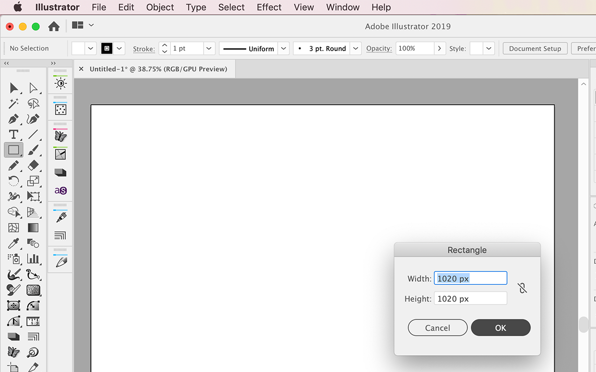
I always start my illustrations with the background, so for that I drew a 1020px by 1020px square shape, filled with color #FEECDC (but you can choose your own color palette, of course) and a transparent stroke. This allows me to visualize the composition from the early stages.
I then drew 3 different looking hearts, the first one filled with red and a darker red stroke color, the second one with pink fill color and transparent stroke, and the third one with a different red fill color and transparent stroke.
Once the three hearts were drawn, I made three separate graphic, static symbols with each one of the hearts for later use.

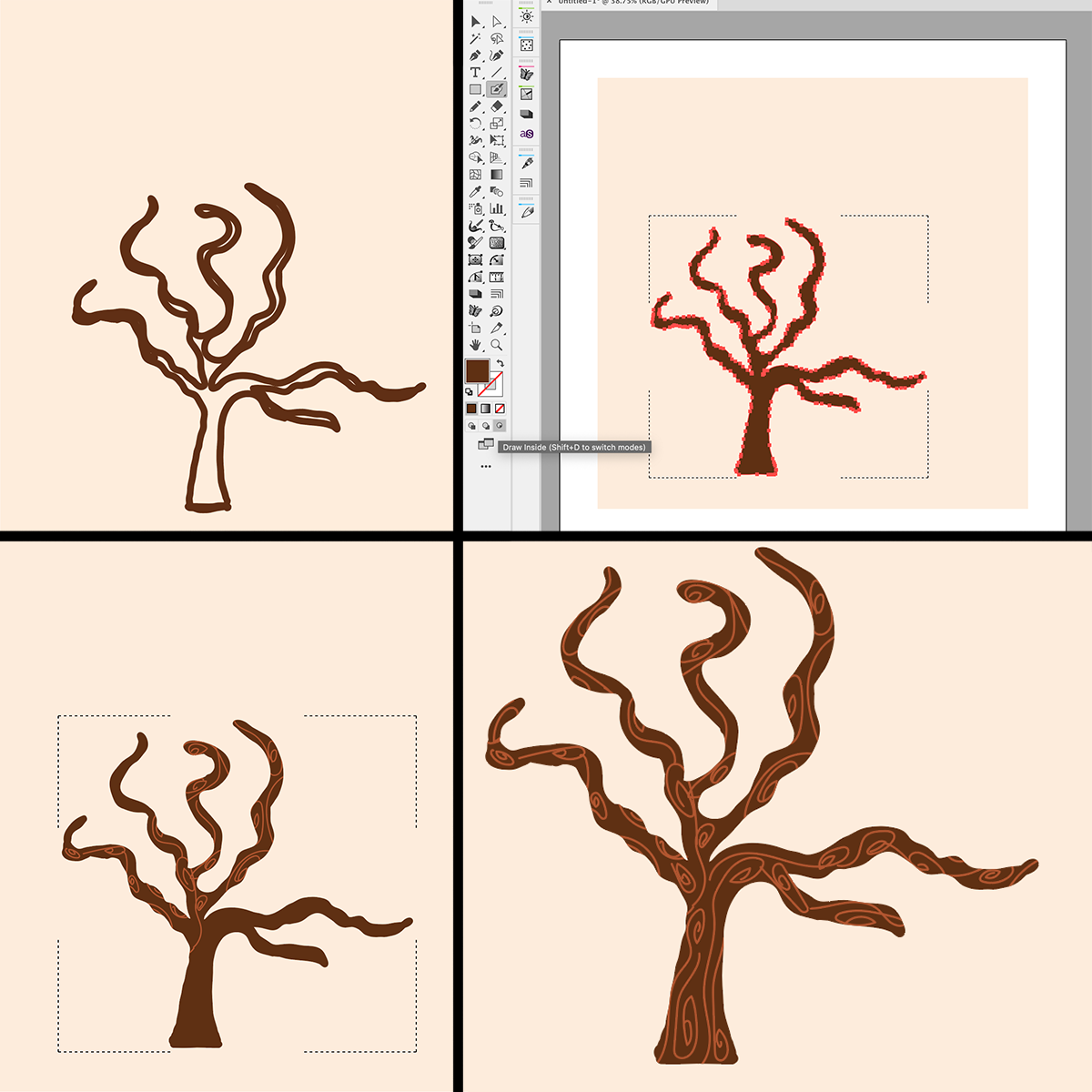
Now it’s time to draw the tree trunk.
On a new layer, and using the blob brush, I started drawing the three trunk and branches. You can always do this step using the pen tool if you wish to have a more symmetric-looking tree, but I chose the blob brush specifically, to make a more organic-looking tree trunk.
So once the base of the tree was drawn, I then chose the “draw inside” selection, and with a lighter color I proceeded to draw some details on the tree. The sky is the limit here; you could of course use the Texturizer plugin, which would render amazing textures! But for this particular illustration, I wanted something simpler.
Now comes the fun part: Colliderscribe’s “Space Fill Feature”!
On a new layer, I drew a transparent stroke/transparent fill path shaped like a treetop right on top of the tree branches. This is where the “heart leaves” will go.
I then placed one of the three heart symbols I created at the beginning, right next to the transparent shape.
On
the Space Fill panel, I chose the following parameters:
Method: Centers
– Uniformity: 6 – Resize All Filling Art: 120% - Vary Size: 2x – Vary
Rotation – Multiply Filling Art: 100 copies; then I clicked the
“Randomize” button.
Once I chose those parameters, I went ahead and clicked on “Make”. This part is a lot of fun, because if you don’t like how it looks like when you click “Make”, you can undo it and tweak those parameters until you find the ones that make your illustration look the way you want it to look.
I then created a new layer and repeated these steps using slightly different parameters.
For this I drew another transparent treetop shape, then brought another heart symbol and placed it right next to the shape, selected both the symbol and the shape, tweaked the “Space Fill” parameters and clicked “Make”.
I repeated these steps 2 more times, first using the first heart symbol I used on the first layer of heart leaves, and on the last layer I used the third heart symbol I had created at the beginning.
Now it is time to add some dimension to the layers of heart leaves.
I left the first layer as it was. Then I clicked the second layer and selected its contents to add a drop shadow effect. (the parameters here are: Opacity: 75% - X Offset: 3px – Y Offset: 3px – Blur: 3px).
I did the same with the third layer of heart leaves (the parameters here are: Opacity: 75% - X Offset: 5px – Y Offset: 5px – Blur: 5px), and with the fourth layer of heart leaves, too (the parameters here are: Opacity: 75% - X Offset: 7px – Y Offset: 7px – Blur: 7px).
I wanted to have some flying heart leaves around the tree, so I created a new layer, chose one of the heart symbols, and added instances of that symbol all around the tree, playing with each symbol instance’s size and rotation.
No drop shadow effects were added to these particular “fly out” heart leaves.

At this point, our tree is ready to receive its little visitors!
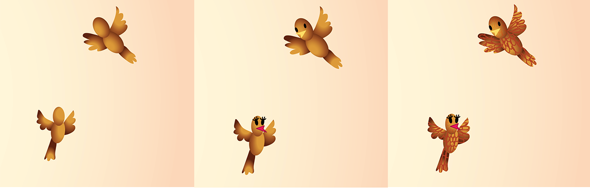
For the little birdie couple, I drew simple shapes with no stroke colors, only gradient fills. And I drew their little feathers using the “draw inside” option from the main tool panel. These little details are important because they add that whimsical touch to the whole concept of this illustration, just like the fly out leaves do.
Our illustration is almost done.
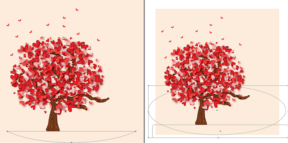
We need to add the shade on the ground. To do this, I drew a large oval shape with transparent stroke and transparent fill. And I needed to cut it in half, leaving only the bottom half, which will represent our tree shade on the ground.
I’m a big fan of the Pathfinder panel, but you can do this with the Shape Builder tool. In my case, I simply drew a transparent rectangle, which covered the part I wanted to keep, I selected both shapes and on the Pathfinder panel, and I clicked on “Intersect”. Then I filled the resulting shape with a circular gradient, which went from dark to transparent.
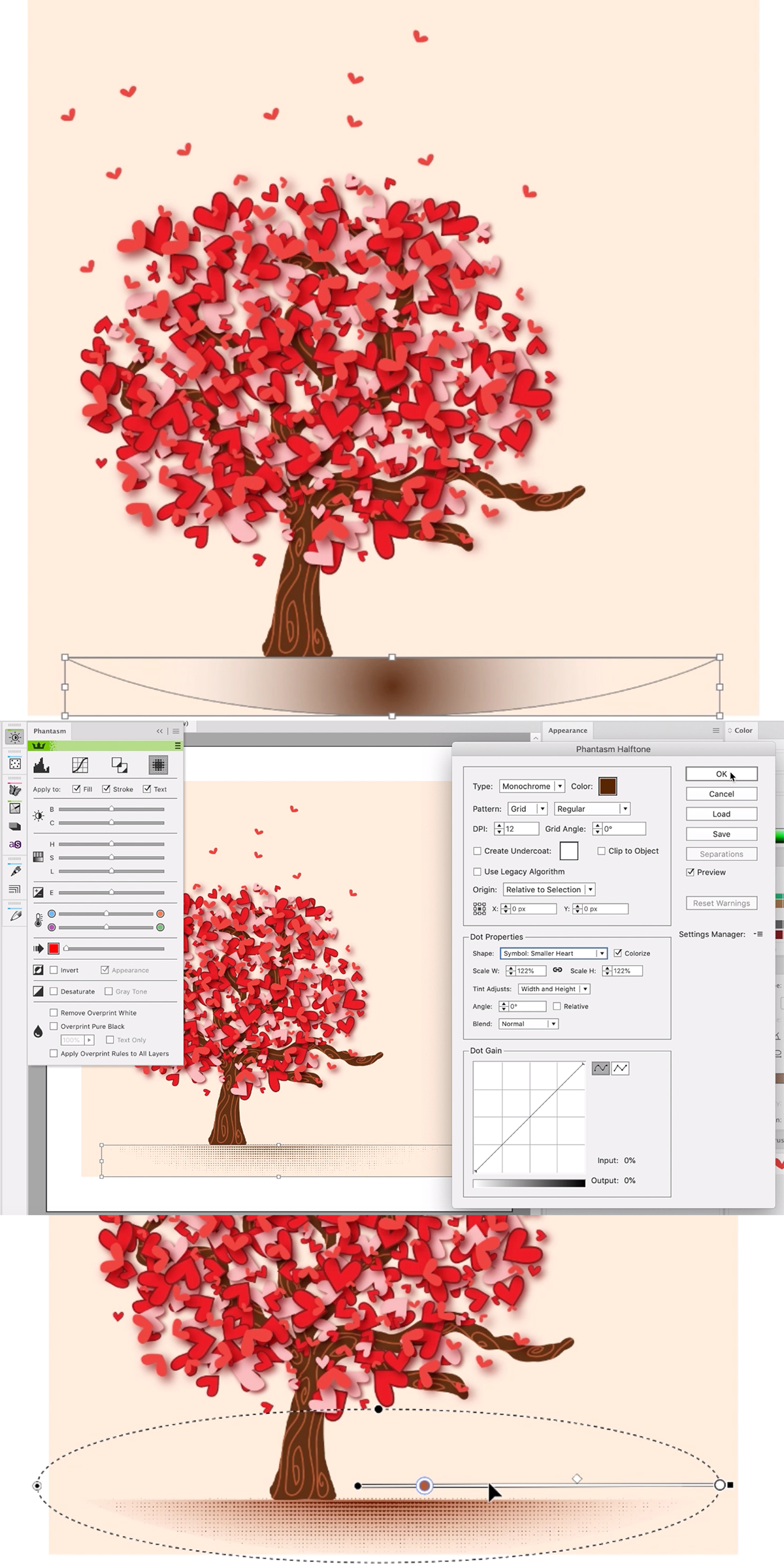
Our dearest friend Phantasm comes to the scene!
I then opened the Phantasm panel, and chose the following parameters on it:
Type: Monochrome – (I selected a color for my ground)
Pattern: Grid / Regular
On the “Dot Properties” area, from the drop down menu I selected one of the heart symbols I initially created, and I put a check mark on “colorize”
Scale W: 122% - Scale H: 122%
Tint Adjusts: Width and Height
And I left all the other options untouched, but you can of course tweak it the way you want. The sky is the limit, and it’s a lot of fun to play around with these plugins, so I encourage you to go ahead and tweak things to your own taste.
Once I was happy with the resulting halftone image, I clicked OK. And I added another gradient on top of this (opacity mode: multiply)
One thing I also love about Phantasm is that it allows me to do some adjustments that used to be unique of Photoshop. So on the final image I went ahead and added some highlights on the back of the tree, as well as on the front, using curve adjustments. Again, I encourage you to play with this plugin, because it’s pretty robust. I personally love it!

Hope you enjoyed my workflow. If you do something similar, please show it to me and link it in the comments, I would love to see what you create <3