Color value fixing with Phantasm
6 minute readBelieve it or not, all of our digital software is mimicking traditional tools. We can use Astute Graphics' Phantasm tool to create washes of color over our illustrations just as we would with acrylic paints, or watercolors. Great for creating color harmony, or pushing objects into the background as well as plenty of other things.
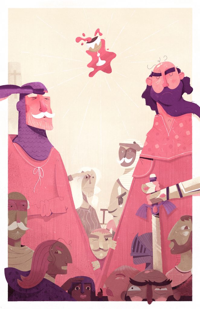
Keeping this tip short and punchy, I wanted to demonstrate a recent example of Phantasm’s usefulness that I stumbled into while working on a personal piece shown above.
The Problem – Values
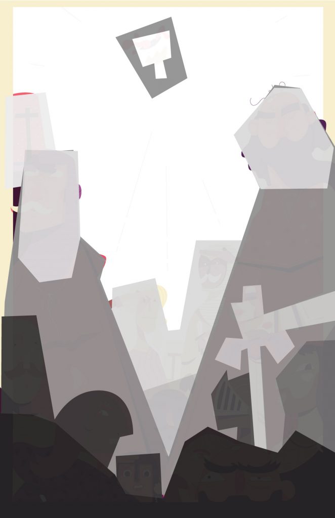
In this Holy Grail personal piece / collaboration with @DannySchwartz I felt once I started to get into color, I had all sorts of competing elements battling for attention. The whole piece just felt a bit overwhelming, which was not the goal of the illustration. Checking things out in black and white by putting a layer with 100% black on top and setting it to “hue”, I realized there was very little hierarchy and structure to my values.
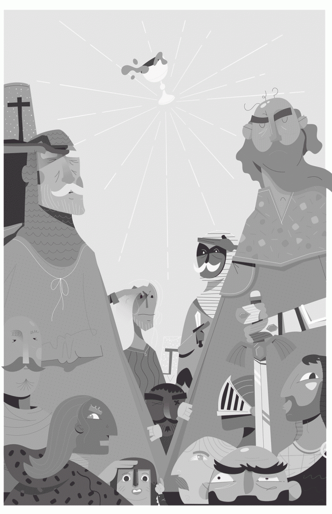
You can see there’s a lot going on in the black and white, there’s just simply too many colors, and too wide a range of values. A lot of the white eyes on the bottom are pulling way too much attention. The background characters (in the center) were feeling like foreground characters, etc.
The Solution – Phantasm
Of course I could have recolored the artwork shape by shape, but knew that my local colors were feeling alright, but that each section / group of objects (basically, each character) was suffering from a value issue. With that information, I quickly built out a loose value draw over in Adobe Illustrator, trying to give myself a bit of a map, giving darker group values to the characters on the bottom and edges, and then very light values to my background characters.
I don’t pretend to know a ton about value linking or things of that nature, though I’m learning. I do know the typical rules of contrast through value and by matching my background characters to the background, it’ll dial them back a bit, and give the eye some time to breath and scan the image.
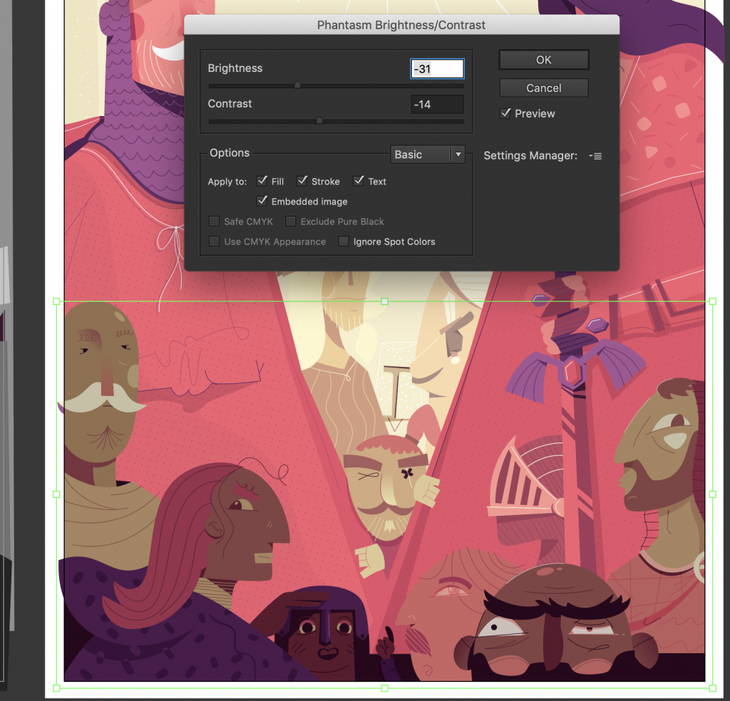
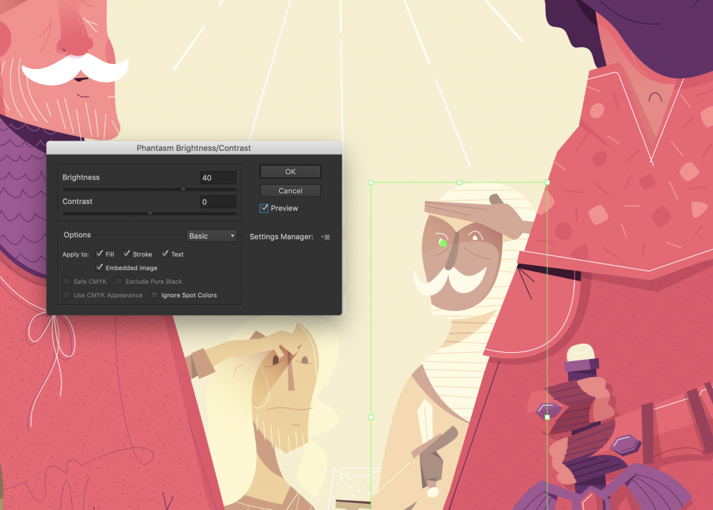
I took a quick draw over with some basic 1-10 value groups to see what works ultimately. Then I grouped my artwork accordingly and began playing with Phantasm, namely “Shift to Color”, “Brightness/Contrast”, and “Hue/Saturation”, continually turning my black and white layer on and off to see how things felt. Knowing I wanted focus to first hit the grail cup, and then the two side characters, and slide down and in toward the center bottom.
The Tools
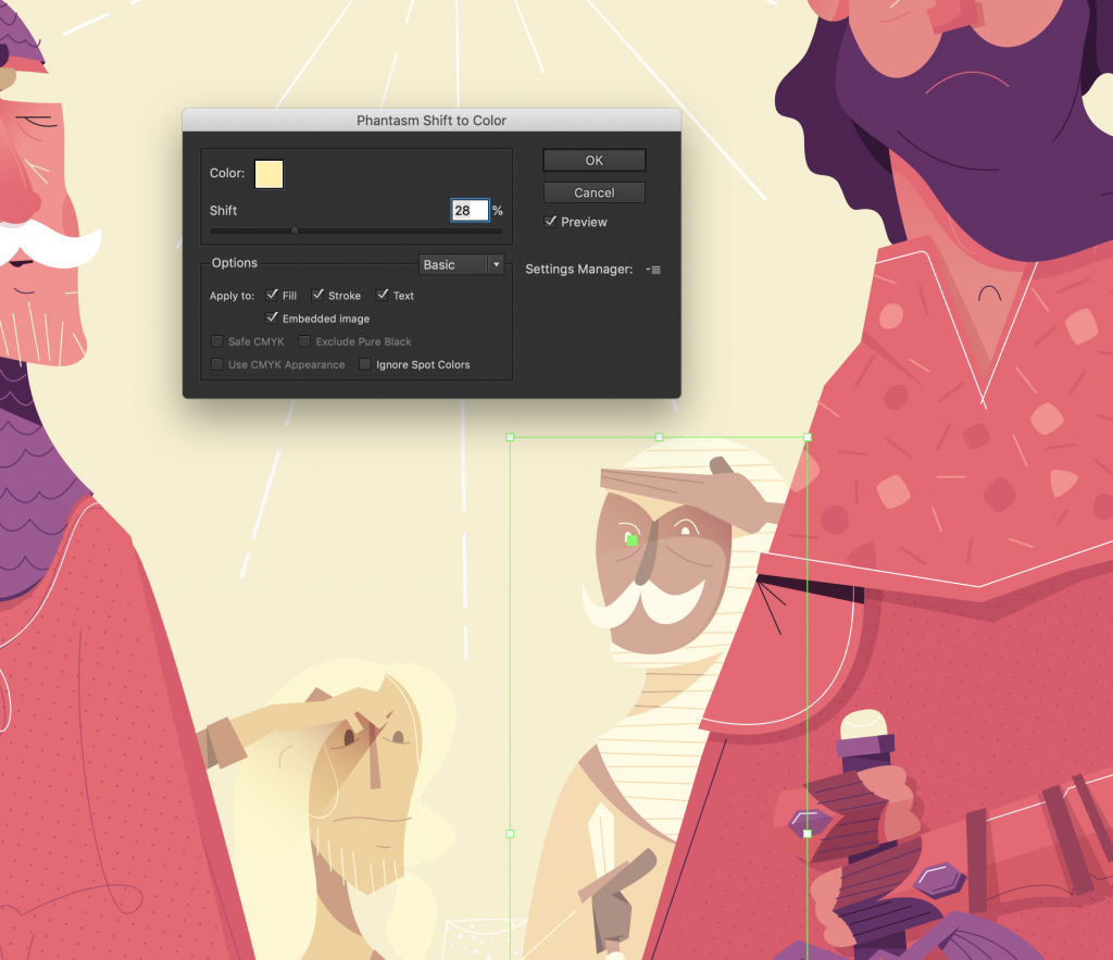
If you’re at all familiar with basic photo editing tools on your phone, or Adobe Photoshop, this will make a lot of sense. In fact, it’s more about mucking about with the knobbies for me than any solid theory. I started with brightening the two background characters quite a bit, and shifting them toward the yellow background color. This helps crunch the range of values for those characters to have a bit less detail. Next were the bottom characters, once again crunching the values by shifting them to a dark purple, and then darkening them overall with the brightness adjustment layer.
The brilliant thing about this is that all of these effects are “live” and can be adjusted at any time. Make sure you group things before setting the Phantasm adjustments, so that you can easily single click the group later, and edit the effect from the appearance panel. You can stack the effects, similar to Photoshop.
Lastly, I added a “Shift to Color” over the whole image, to warm things up a bit with a warm purple, set to a very very low percentage. This is similar to when painters will do an underpainting / wash of a color of purple to get some chroma and general purple hues to come through the paint, unifying the image overall.
The Results & Summary
As you can see, from left to right the image is much more palatable and easy to navigate with your eyeballs. Notice the respective value structures below each.
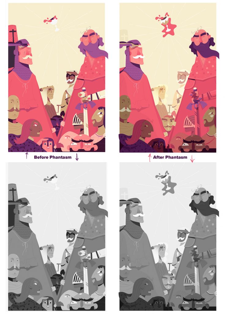
The changes are subtle, but notice each character has less of a wide range of values inside each group. Less random brights and darks.
The main takeaway from this should be to understand that using Phantasm, you can adjust your illustration’s brightness, contrast, and general balance of colors very quickly. You can group parts of the illustration and control the adjustments with more finesse, and all of these changes can be continually edited.
For a bit more process on this piece unrelated to Phantasm, check the project on Behance.
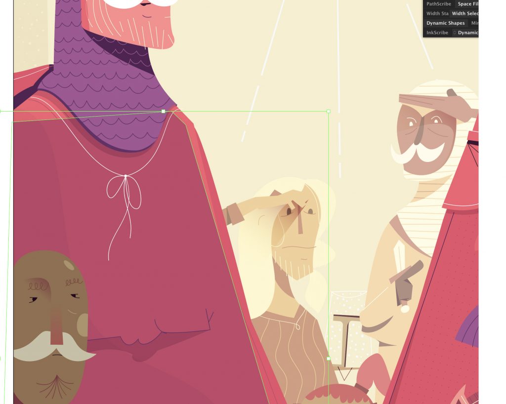
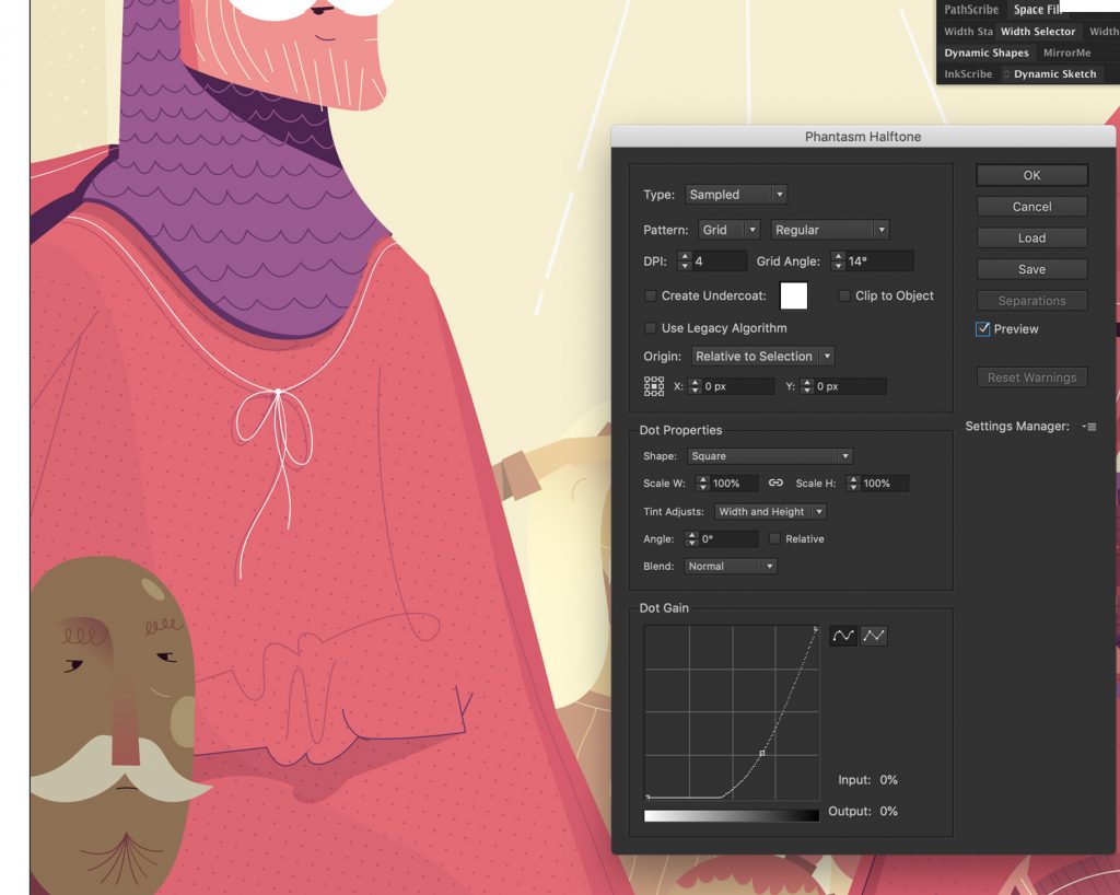
Bonus Halftones
I just realized while finishing this, that I used Phantasm’s Live Halftone Effect on the two large characters chest / gowns. The halftone tool is a dead simple but super precise way of making some halftones. Great way to keep your colors limited but get some more mid range values. A few screenshots of how that worked itself out below.