Tidying up your type with Astute Graphics
9 minute readJust because your type is wonky and playful doesn’t mean you can’t have order in building it.
I’m a full-time illustrator that comes from a computer science undergraduate degree, which creates a weird hurricane of hot and cold in my workflow. Maybe hurricane isn’t the best term: how about a great balance of warm and cool. That is, I tend to have work that is pretty playful, bouncy and whimsical, but my mind works in a very rigid, organized, systematic way.
So when I’m creating lettering for a project, I use a lot of digital tools for assistance. I rely heavily on a few of Astute Graphics’ plugins to stay organized and tidy, while making something that looks chaotic and off the walls.
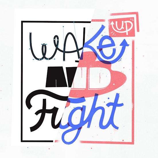
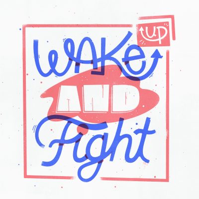
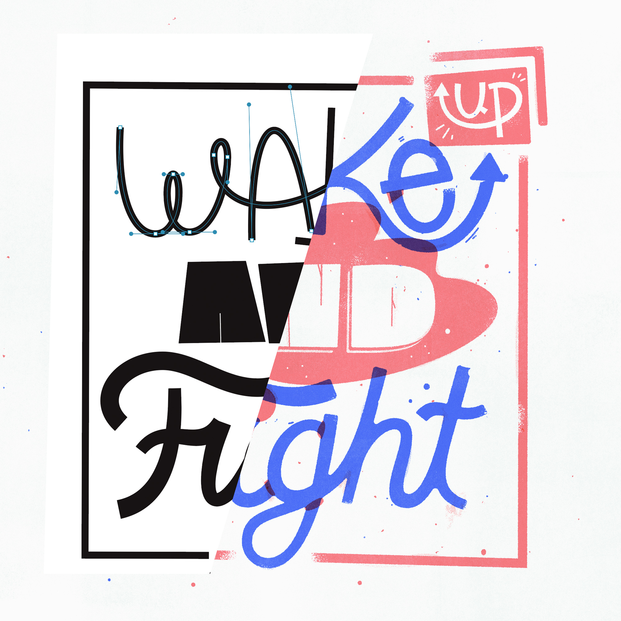
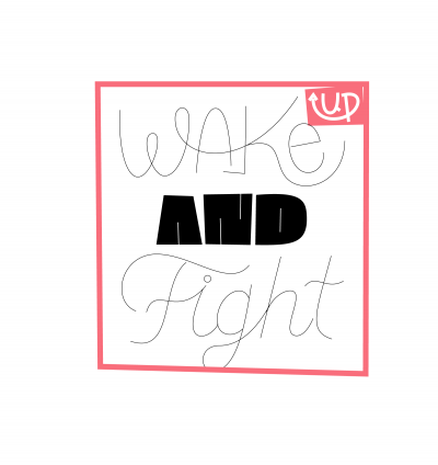
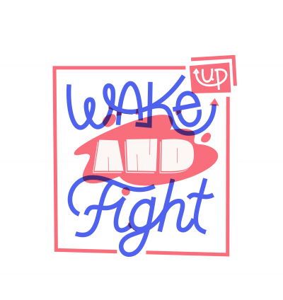
I think the best way to demonstrate this is to quickly go from start to finish in the process of creating the piece above and highlighting particular uses of the tools that help me.
Idea
Each year two of my great friends and letterers Josh Lafayette and Chris Piascik draw the quote from Woody Guthrie’s new year's resolution list from 1943, “Wake up and Fight” is his 33rd and last resolution on the list. Every day, Woody. Thanks to Josh for bringing this quote to my attention years ago. Something I think about often.
Other than that, I just simply wanted to have fun drawing some letterforms and keeping things loose. I treated this piece as a 2-color Risograph, overlaying the red and blue to get my third tone.
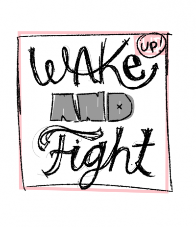
Sketching
I start with a sketch on paper with a pencil, then refine a bit in Photoshop, and quickly hop into Illustrator especially for a loose piece like this. I knew I’d be using Illustrator to my advantage, moving letters and words around so it’d all fit together eventually.

Refining the sketch in illustrator with DynamicSketch
DynamicSketch is a useful plugin for me that I use pretty much any time I’m in Illustrator now. It started when I wanted to make organic blobby shapes, but I find myself using it more often lately. The thing about all of Astute Graphics’ plugins is they take time to get used to, but once you do, they’re irreplaceable.
So I draw through a lot of my letters with just a simple 1pt stroke; I have a vision of how this will look in my head and know I can fatten strokes and give them varying weights, etc. later on. I just need to get my paths correct.
DynamicSketch lets me draw over and over a few times and use the average of the passes to get the stroke to level out to a nice medium. The first video here is showing that repeated process, and the second video is a video of me using DynamicSketch and VectorScribe to loosely get every letter vectored. (This second one you may want to go through quickly unless you like watching paint dry!)
While DynamicSketch does a good job not spamming you with a million anchor points, I love having the absolute fewest necessary, so once I get the paths I am happy with, I use the Smart Remove Brush tool, which is part of VectorScribe. This lets you use a certain tolerance (defined by you) to remove anchor points. When you’ve worked in Illustrator for a long time, you get a good sense of what points can go without endangering the shapes’ integrity. So I go through and get these as slim as possible. Sometimes a point is being stubborn (the plugin might think it’ll change the shape too much if it’s removed) so you can hold Alt (Option on Mac) when clicking to remove it anyway. Like an override.
During this time I’m also often extending or shortening paths along their trajectory (I did this with the K leg a few times) with the Extend Path Tool (also in VectorScribe), and I’m sometimes adding points on horizontal and vertical tangents, but that comes a bit more later.
Refining my vectors
Once my thin line sketch is good enough, I start fattening up the strokes to get them closer to how I imagine them in their final form. Sometimes I am just rebuilding everything again, or modifying that sketch vector. Keeping everything as strokes as long as I can helps me modify the work easily.
I use VectorScribe basically as my super pen tool. Too many little things in here to list that benefit it, but I’ll highlight a few as they come up. For the e in ‘wake’ I wanted a tall egg like top, so basically I wanted to move two bezier handles at once (so that they’d stay even), I made a little video to show how that worked. This is not something you can normally do in Illustrator without the plugin. It’s super useful when you’re trying to move multiple handles at once!
The other thing I’m doing at this point is dragging the paths around by the path itself, rather than bezier handles (though I do that too). With VectorScribe’s PathScribe tool, you can pretty much just yank things around however you want.
Blobby time
Once I started adding in color to this piece, I realized I wanted some ‘knockout’ shapes to break up color distribution. For the ‘AND’ bit, I decided to put a washy blob shape in the background and use the paper color for the letterforms themselves. I drew this with DynamicSketch again, because I didn’t have a particular shape in mind, just something that’d cover some ground. After drawing that, I smart removed any extra points and relocated a lot of anchor points.
Here’s an interesting bit: whenever I’m trying to make something particularly curvy in and out like this center shape, I find 45 degree bezier handles work best. So while DynamicSketch usually defaults to 90 and 0 degrees, I go through and manually drop in anchors at 45 degree angles and then remove the 90/0s. It’s a mindless therapeutic exercise but it makes the curves just barely nicer, which is worth it for me.
Tying things to a baseline
The last 30 minutes or so I’ve just been arbitrarily lining things up to nothing. Around now, when I’m happy with the overall composition, I’ll start bringing in grids and lining letters up to a baseline, x-height, cap height, etc. I can always bounce things around later, but I want to make sure the letters at least start to make sense, so i can break them later.
Giving it depth
Nearing the end here, I thought the letterforms felt a little stiff being mono weighted. Especially the script ‘Fight’. So I used WidthScribe, another Astute plugin, to super easily give some varying widths to the strokes. This gives the shapes a sense that they may have been drawn with a marker nib, or something analogue. Never a bad thing!
I basically set WidthScribe’s Width Gradient tool to start at 25pt width and end at 35pt and started whipping the tool around until I was happy. There’s some theory here of how this would mimic a brush nib’s pressure on downstrokes vs upstrokes etc. But also I’m kind of just flying by the seat of my pants and what looks neat.
Expanding and repairing
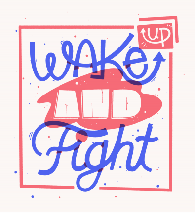
Last thing I want to do before bringing this into Photoshop for its final treatment is to add some rounded corners that may mimic ink pooling from printing, especially more traditional printing methods like letterpress.
Basically I’m just beating up the artwork some by rounding corners. Illustrator finally has a nice tool for rounded corners, but once again VectorScribe has a better solution with its Dynamic Corners tool. Not only was it around before Adobe had their implementation, but it also has some extra benefits.
Before I can do that, I have to expand the appearance of all the strokes, so first I make a copy of it (so i have my old stroked artwork still which is easier to modify) and then I expand the appearance — and it creates a million anchor points! No fear, VectorFirstAid comes in hand here and takes care of 99% of those extra points. You can give it the tolerance you want, but watch as it just cleans up any unnecessary anchor points and brings you back to tidy.
Once I’m down to a decent amount, I’ll use VectorScribe to move any points to vertical and horizontal tangencies, which you can see in the video here. This still leaves a few straggling points, which I remove with smart remove.
Done!
Finally I bring this into Photoshop and add some texturing and general weathering to the illustration and save it out!