How to create filled-line avatars with Scott Lewis
11 minute readHow to create filled-line avatars
Drawing faces in a simplified, iconic style can be challenging because typically icons use fewer details and do not use the tonal values that give the illusion of three dimensions. In this tutorial I will share my technique for creating faces using basic geometric shapes to make iconic and unique avatar icons.
Know your anatomy
We are going to be creating icons with simple shapes but we still want the faces to be convincing. In this particular style, we are not aiming for realism but the avatars should be believable as human faces. In order to make them convincing we will need to be aware of the basic proportions of the human face even if we do not intend to strictly adhere to those proportions.
Icons work best when the height and width ratio is very small meaning closer to a square than to an elongated rectangle. This might seem really counter-intuitive, but it is often necessary to visually lie in order to make an icon visually convincing. An icon that is too long and thin doesn't reproduce well at small sizes. We also often find that icons that try to represent an object or idea too literally are not quite convincing.
When I draw the avatars I start with anatomical accuracy but I intentionally deviate from 100% accurate anatomy in order to make the image more appealing as an icon. For instance, you will notice that I place the eyes lower on the faces of the avatars than they actually are on a real face.

In this tutorial I am using my own face to work from for two reasons. First, I don't need a model release in order to use my own face. I give me permission to use my face. Second, since I am more familiar with my own face than any other, it is easier to demonstrate how to apply the principles with a subject I know well. I do have to look at it every day, after all.
Three Stages
Creating avatars is really no different from painting or drawing in any other medium. We are going to follow three rough stages with distinct steps within each stage. 12 steps may seem like a lot but they go quickly and I've broken it down to a level of detail that makes understanding what we are doing easier to follow and hopefully you don't have to guess what I'm suggesting you do.
Generalize
The first concern with drawing anything is to map out the locations, shapes, and relative proportions of the different major elements. Don't worry about details in this stage. We are only concerned with the largest elements, where they appear, and how they fit together.
Step 1
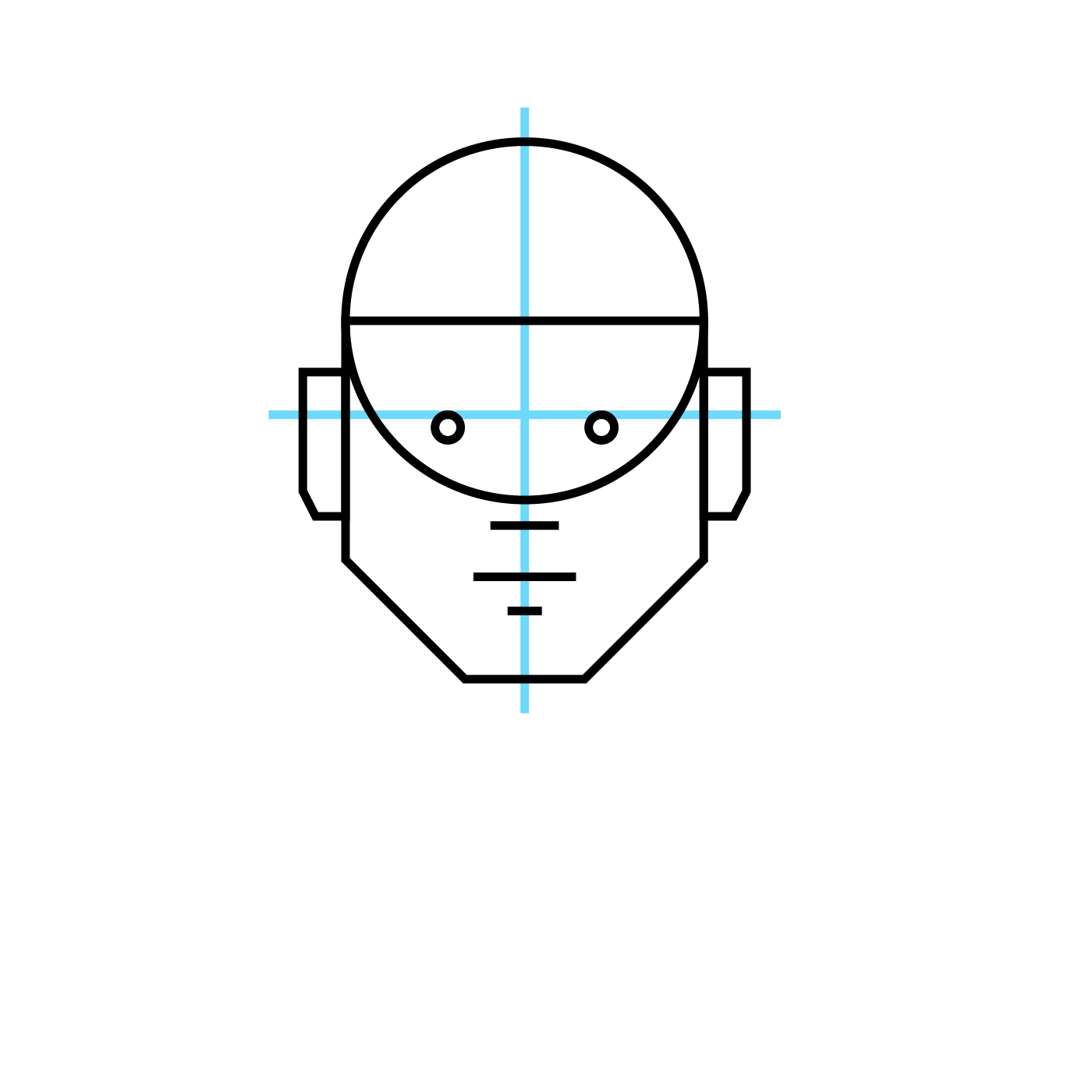
Start with equal-sized circle and square. The actual size of the circle and square doesn't matter but they should have the same diameter. I prefer to work in multiples of 16, typically at 256 x 256 pixels for avatars.

Step 2
Next, move the square down so that the top edge of the square aligns to the center point of the circle. The circle will make the cranium and the square, with modifications, will make the cheek bones, jaw, and chin.

Step 3
To create the jaw line and chin angle the bottom corners in towards the bottom edge. There is no set angle or position of the angle. What angle you choose will depend on how long you want the jaw line to be and the width of the chin. Since this is roughly based on my face, I'm going with a more square jaw and chin. The point at which I begin the angle is about 1/3 of the height of the square from the bottom edge.

Step 4
Next, add simple shapes and lines to indicate the location of the eyes, ears, nose, mouth, and bottom lip. Remember, you can tell visual lies to achieve the effect you want so you have some latitude here but it's important to be aware of the real proportions of the human face so you can deliberately deviate to achieve the desired effect.
Step 5
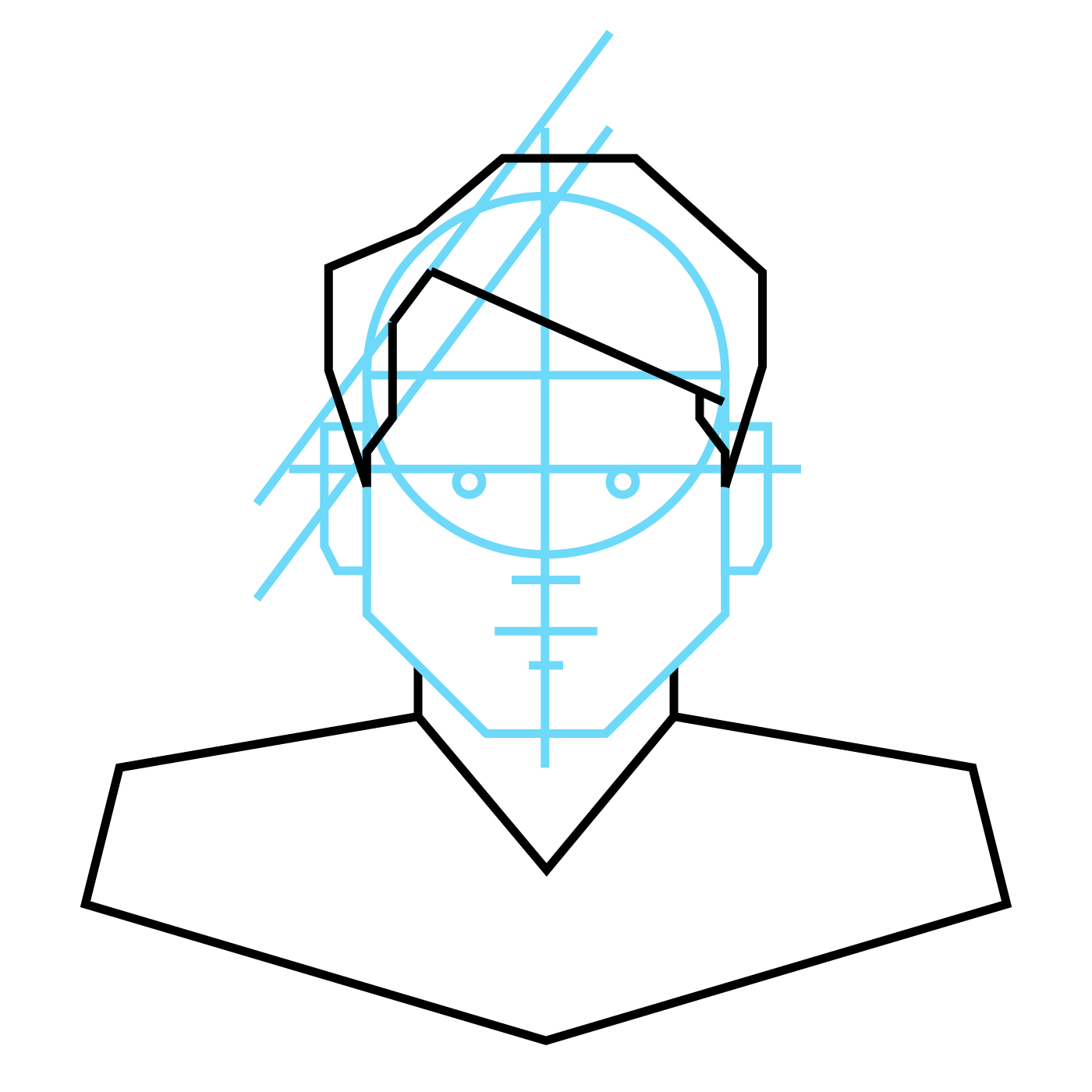
And, finally, add the neck and shoulders using angles and basic shapes the same way we did the head and face. You can adjust the width for the neck, angle of the top edge of the shoulders (the trapezius), and the angle of the outer arms to indicate a thinner (ectomorphic) or more muscular (mesomorphic) body type.

Elaborate and Refine
In this stage we will start adding details to the major elements. We are not overly concerned with very fine details but we do want to add the most visible details such as major lines and shadow. We will also start to refine the shapes of the larger elements such as the shape of the face, the hair, and clothing.
Step 6
Add the outer shape of the hair using straight lines and and angles. Again, we are following the same principles from above: create the outermost shape of what we're drawing with just the outermost angles and straight lines. We will add more details later. For now, we are just trying to capture the general shape and proportion. One thing that will help get a more natural feel for the hair is to pay attention to which lines overlap others. Notice how the line of the hair above the forehead overlaps the hair on the sides indicating this part of the hair is closer to the viewer and on the front of the head and the sideburns go back in space.
Also, notice how the angles are the same with the slant of the side burns and the hair line. Mirroring angles like this will help tie your design together and give a cleaner icon.
Step 7
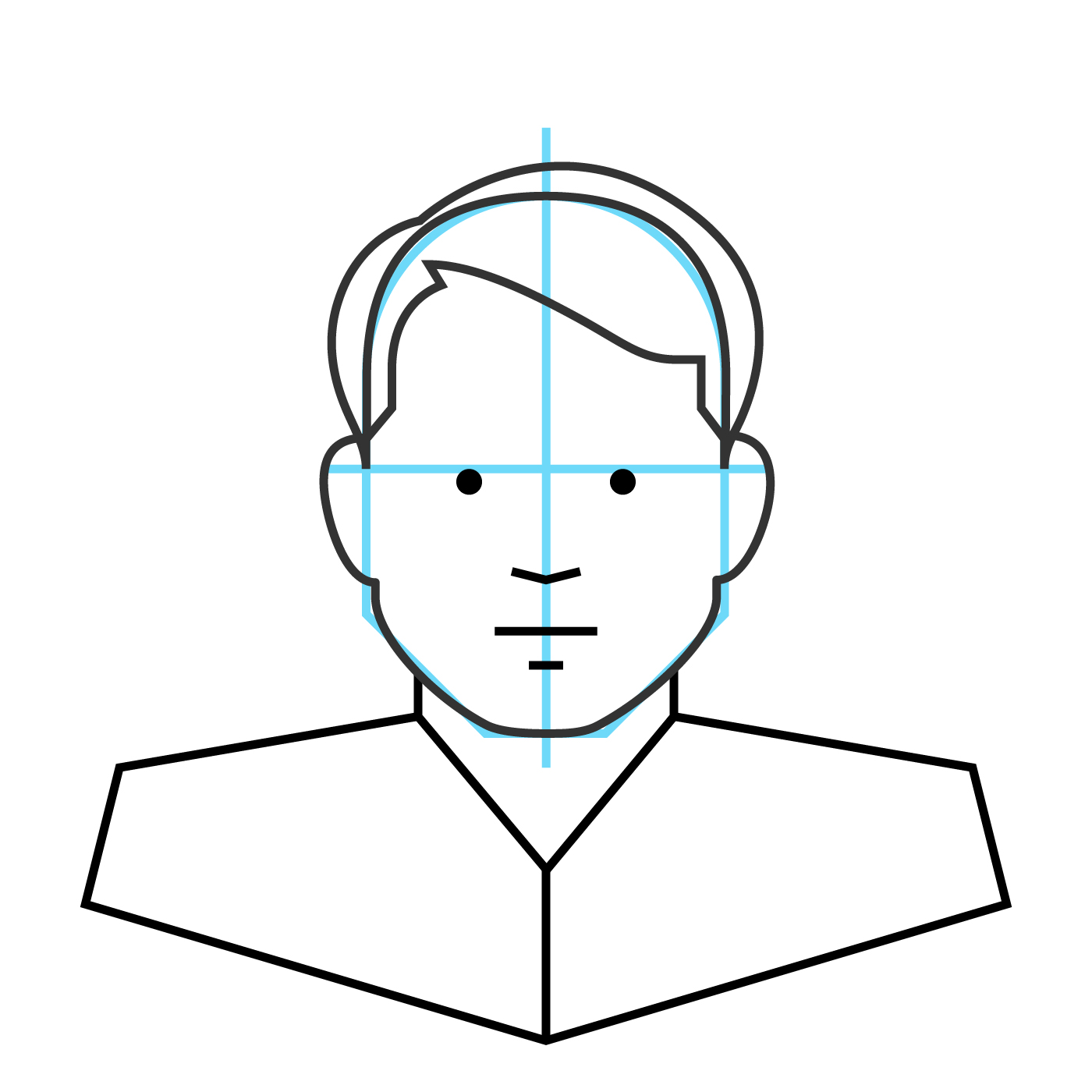
Now we are going to start refining the avatar by removing all of the lines except the outlines of the face and hair. I like to leave the top edge of the head, however, so if I want to change out the hair for a different style it is easy to do so. There is no limit to what you can do with the hair and we have added some fun hair styles in the Diversity Avatars collection.

Step 8
Next, round the facial shapes to be more human-like. Round the jaw and chin. The width of the chin and cut of the jaw are determined by the angles of the straight lines but you can make your avatar more chiseled or have softer features depending on how much you round the corners.
Step 9
Now we will thicken the line and add further details like hair color, highlights, and the collar for the shirt. Clothing is another element that is without limit and you can have a lot of fun. You can also help define the meaning of your icon depending on what type of clothing you add. For instance, a hardhat for a construction worker, overalls, a clerics collar, a bow tie (because bow ties are cool), etc.

Step 10
We are now ready to start adding the base colors and some more lines to indicate shadows on the face. You don't need to add any tonal values or highlights here. Just fill in the background colors for your skin tone, shirt, etc.

Unify
The last stage is to tie the design together with the small details that give the illustration volume and depth. You do not have to add as much detail as I am doing in this stage. Using a more minimal approach can create powerful icons that can be used at smaller sizes without the details being lost or becoming muddy. I really intend my avatars to be used more as spot illustrations so I go with more details rather than less.
Step 11
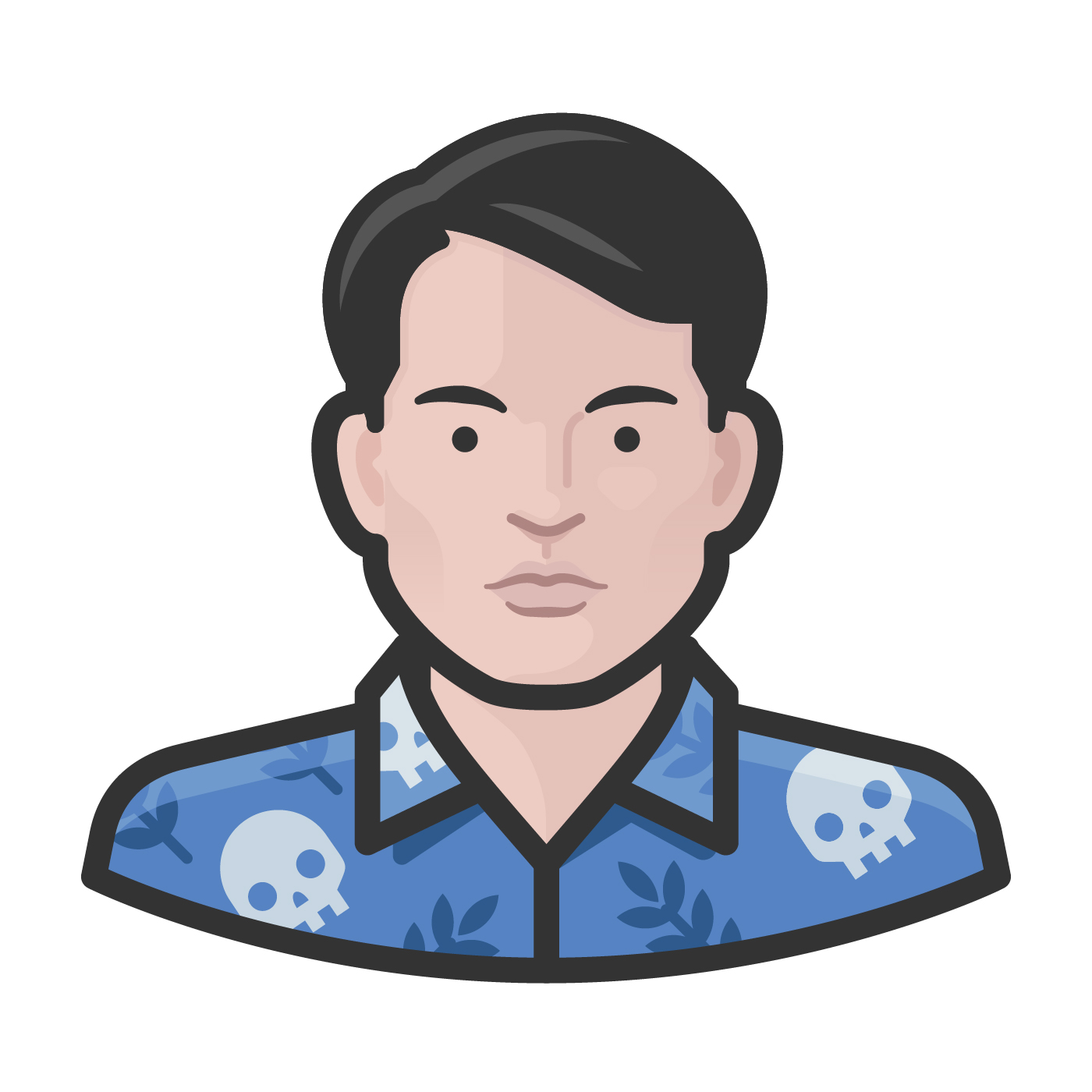
Start adding highlights and shadows. Change black lines on facial details to skin tone color and round the angles and corners of the lines. Add more highlights and shadows to create volume. Add shadows to show cheek bones and give the face depth. Here it is okay to use gradients to give the avatar some volume. Add shadows to show ears and shadow of hair on the face.

Step 12
And, finally, to make the avatar fun and unique, I'm going to add this cool-ass pattern to the shirt. I love skulls and many of my shirts have skulls on them. I do not have a skull-themed Hawaiian shirt but I would wear this design for sure.
Conclusion
It seems that most people think faces are hard to draw, and they can be if you don't take time to study the basic geometry of the human face. But with practice, it isn't as difficult as it might seem at first.
In this article I opted to do a self-portrait but you can use the principles in this article to recreate the likeness of even well-known people. A trick to doing this is to examine how the face you are trying to recreate deviates from the generic dimensions we started with in this example. In a follow-up article, I will explore the concept of diversity as it relates to race, ethnicity, gender, and age.
Further Reading
The purpose of the Diversity Avatars collection was to equally represent all people not irrespective of but specifically for the things that make faces look different. No two faces are exactly alike and making avatars has been a really interesting way to become familiar with the subtle and not-so-subtle differences.
Thanks to Scott Lewis for the tutorial.
To learn more about Diversity Avatars, visit their site at https://diversityavatars.com/about
