How to create the bevel & emboss effects for editable text in Adobe Illustrator
12 minute readBevel and emboss effects give text a sense of depth, weight, and tactility. Whether you're going for a chiseled stone carving, a raised metal stamp, or a soft letterpress impression, there are now more ways to achieve these effects in Adobe Illustrator. The best part of these different methods is that they all stay live on editable text.
In this updated tutorial we'll cover three methods, ranked from fastest to most controlled, and show how Astute Graphics tools can take the results further.
Since Illustrator 2022 (v26), the 3D engine was completely rebuilt as Effect > 3D and Materials — a panel-based workflow with real-time lighting, material controls, and significantly improved bevel rendering. The legacy dialog is still accessible under Effect > 3D (Legacy) > Extrude & Bevel but is no longer recommended.
Method 1: 3D and Materials (Illustrator 2022+)
This is the quickest route to a bevel effect and works well for bold, display-weight fonts.
Type your text. Give it a non-black fill (#999999 in this case) so the 3D shading is visible.
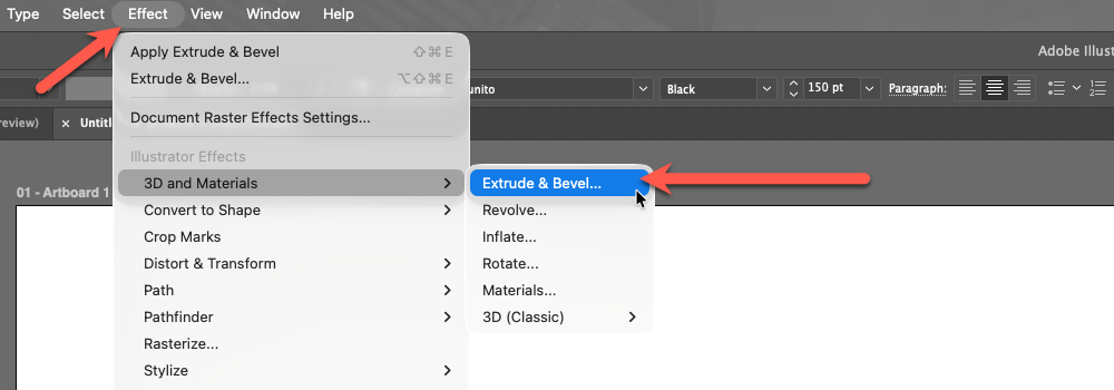
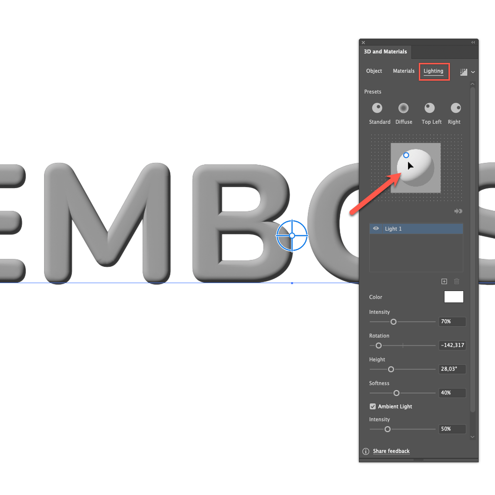
With the text selected, go to Effect > 3D and Materials > Extrude & Bevel. The 3D and Materials panel opens.
Under Object, expand Rotation and set the Preset to Front. This keeps your text facing forward with no perspective distortion.
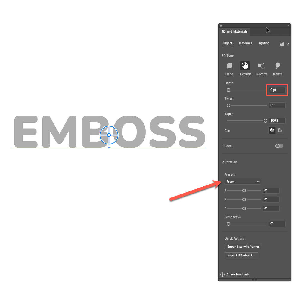
Set Extrude Depth to 0 pt. This removes the 3D extrusion entirely, leaving only the bevel on the front face.
Enable Bevel and choose a style:
Classic: Straight angled edge, great for metallic effects.
Rounded: Softer, more organic edge.
Step: Retro/pixelated staircase effect.
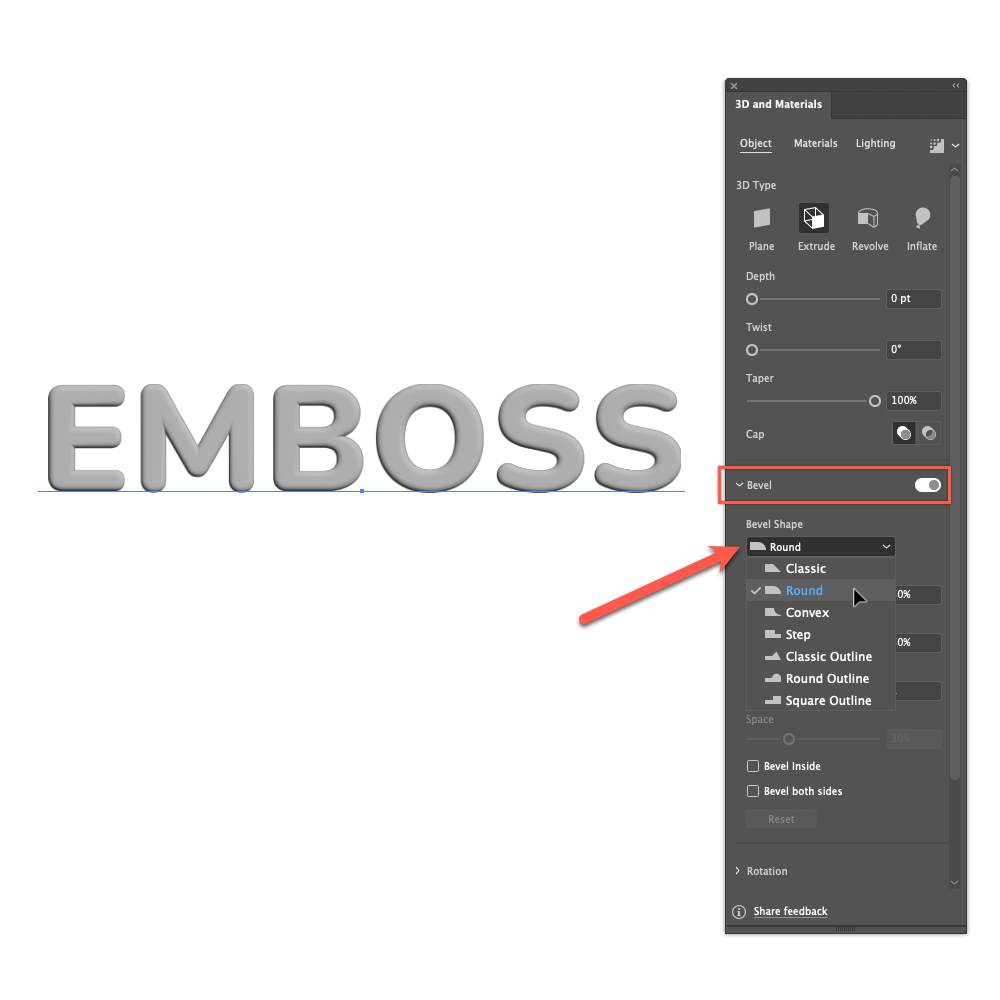
Adjust Width and Height to control how prominent the bevel edge is.
Click on the Lighting tab to adjust the light source direction, intensity, and ambient light. A single light from the upper-left is the classic emboss setup.
Note: The 3D and Materials bevel works best on bold, simple fonts. On thin or complex letterforms it can produce artifacts at intersecting bevel edges. If that's an issue, use Method 2 for cleaner results. This method sometimes doesn't work very well if your computer doesn't have a modern graphics card. Also, you need to render in high quality for better results.
Method 2: Appearance Panel (Most control, works on any font)
This is the workhorse technique: fully live, infinitely adjustable, and it scales perfectly to any font size or weight. This method remains the gold standard for editable type effects.
Building the Emboss Effect
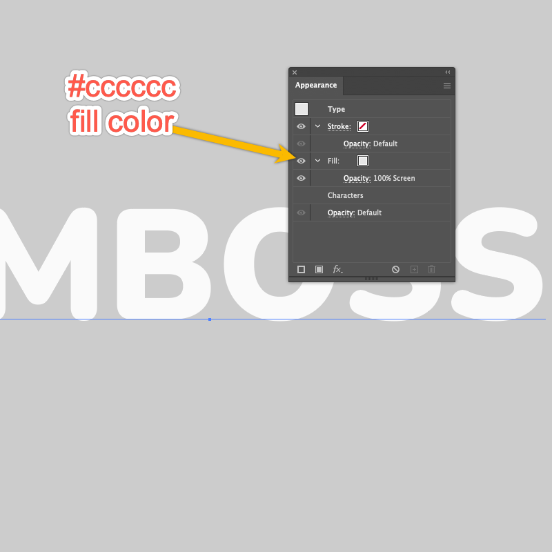
Add a background to your document, let’s try a light gray (#cccccc).
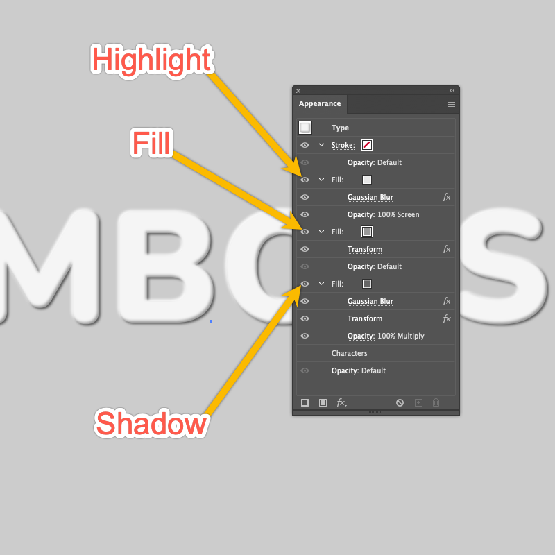
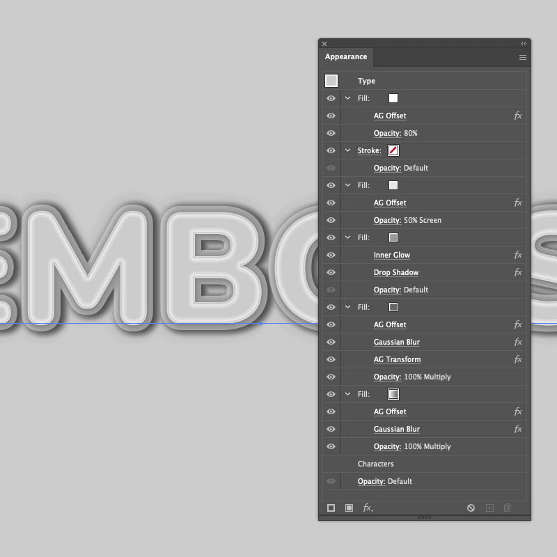
Type your text. Open the Appearance panel (Window > Appearance). In this panel, remove both the fill and stroke by setting both to None.
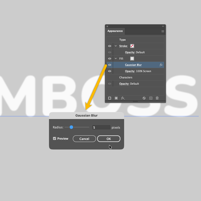
Click Add New Fill at the bottom of the Appearance panel. Set the color to a cloud-gray (#e6e6e6) and the blending mode to Screen. This fill becomes the highlight layer (the bright side of the emboss).
With that fill selected in the panel, apply a Gaussian Blur (Effect > Blur > Gaussian Blur). A radius of 2-5 px works well depending on your type size. This softens the highlight so it blends naturally into the letterform.
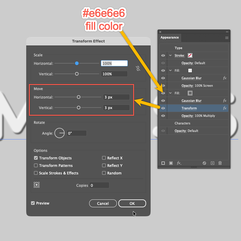
Drag this fill onto the Plus icon in the Appearance panel to duplicate it. On the duplicate, change the color to a dark shade of your base color; stone gray (#666666) in this case, and set the blending mode to Multiply. This fill is the shadow layer.
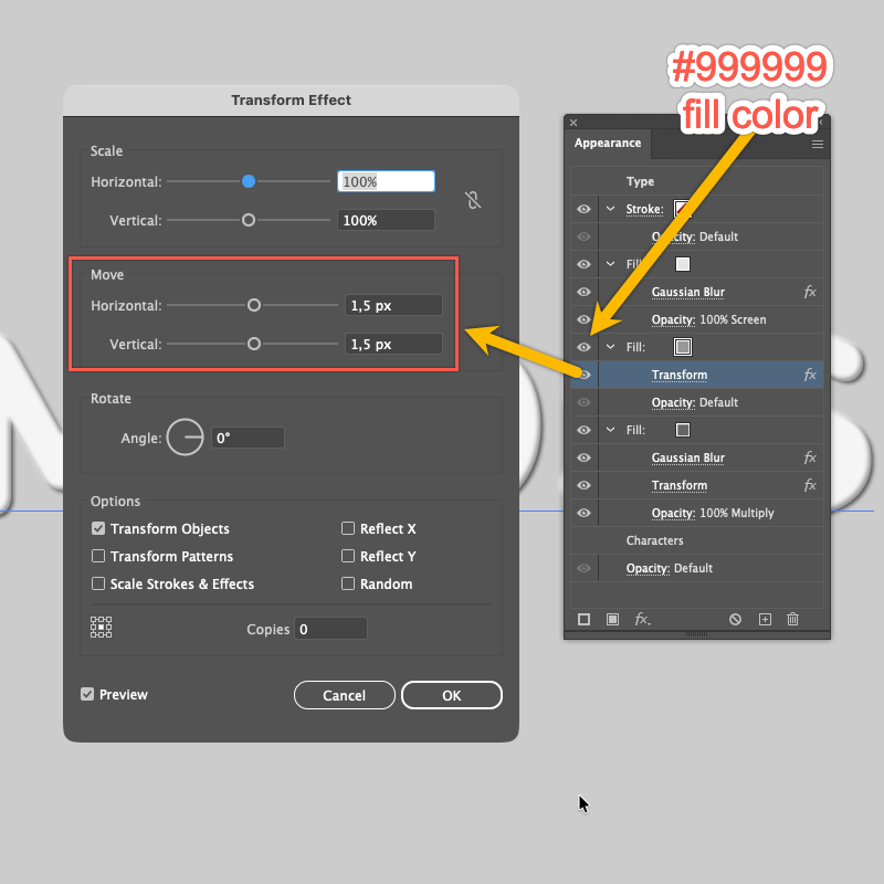
With the shadow fill (Multiply) selected, apply the native Transform effect (Effect > Distort & Transform > Transform). This displaces the shadow fill downward and to the right, creating the illusion that light is hitting the text from the upper left.
In the dialog, set:Horizontal Move: +3 px
Vertical Move: +3 px
Copies: 0
Add a third fill colored to match your document background: pebble gray (#999999). Place it between the highlight and shadow fills in the Appearance panel stacking order. Apply Transform to this fill with values half those of the shadow fill (e.g., +1.5 px H / +1.5 px V). This creates the flat upper face of the emboss.
The text remains fully editable at every stage.
Building the Letterpress Effect
The Letterpress effect simulates text pressed into paper, the letters appear sunken rather than raised.
Type your text. Open the Appearance panel (Window > Appearance). In this panel, remove both the fill and stroke by setting both to None.
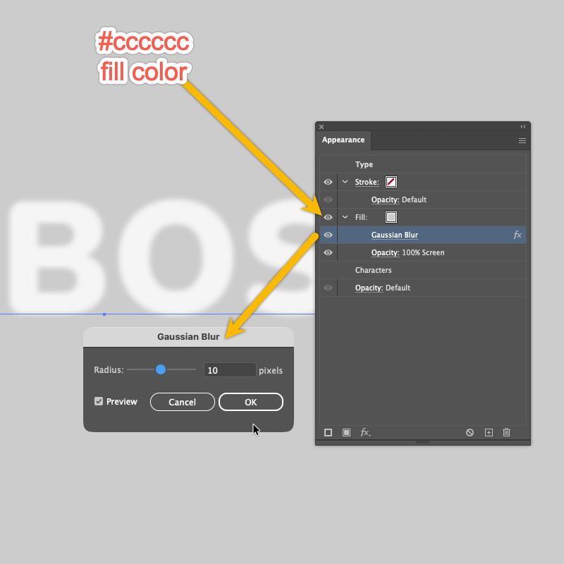
Click Add New Fill at the bottom of the Appearance panel. Set the color to a light gray (#cccccc) and the blending mode to Screen.
With that fill selected in the panel, apply a Gaussian Blur (Effect > Blur > Gaussian Blur). A radius of 2-10 px works well depending on your type size.
Duplicate the color fill, move to the top, remove the effect and set the blending mode to normal.
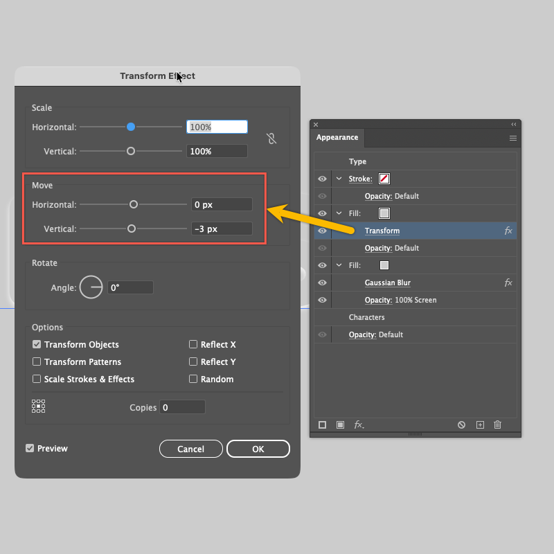
Select the top fill and apply Transform to it:
Horizontal Move: 0 px
Vertical Move: –3 px (a negative value shifts it upward)
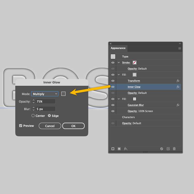
With that fill selected, apply Inner Glow (Effect > Stylize > Inner Glow):
Mode: Multiply
Color: Dark Gray (#5e5e5e)
Opacity: ~75%
Source: Edge
Method 3: AG Transform (Most scalable, Astute Graphics)
For production workflows where text size changes frequently, the native Transform effect has a significant limitation: its offset values are absolute (in pt or px). If you resize the text from 72 pt to 200 pt, the 3 px shadow looks proportionally tiny.
AG Transform (Effect > AG Utilities > AG Transform), part of the VectorScribe plugin from Astute Graphics, solves this with a Relative submode that calculates offsets as a percentage of the object's bounding box. Scale the text and the shadow scales with it — automatically.
How to apply AG Transform
Wherever Method 2 uses Effect > Distort & Transform > Transform, substitute it with Effect > AG Utilities > AG Transform. In the dialog:
Set Move to Horizontal/Vertical.
Change the submode dropdown to Relative.
Enter your offset as a percentage (e.g., 0.5% H, 0.5% V instead of 3 px).
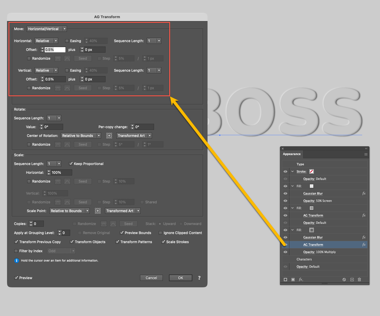
Everything else in the Appearance panel stack stays the same. The visual result is identical — but it now stays proportionally correct at any size.
Bonus: More Astute Graphics techniques
Stylism: Adjust effects visually
The Stylism plugin lets you adjust the Gaussian Blur, Inner Glow and Drop Shadow parameters by clicking and dragging directly on the artboard. When tweaking offset values to get the shadow direction just right, Stylism's on-canvas interactive UI widget makes iteration significantly faster.
AG Offset: Crisp multi-layer bevel edges
For a harder, more graphic bevel style, AG Offset (Effect > Stylism > AG Offset) can be applied inside the Appearance panel to create multiple concentric offsets of the letterform with independent fill colors. Unlike the native Offset Path effect, AG Offset works correctly on open paths, supports multiple steps, and stays fully live on text objects.
Add a 6 px offset (light fill) with a 12 px offset (dark fill) for a clean hard-edge bevel.
Live Effect Explorer: Manage complex stacks
When your Appearance panel has 5+ fills and effects, the Live Effect Explorer (at the bottom of the Effect menu when Stylism is installed) gives you a bird's-eye view of every live effect across your selection. Hide or delete effects without hunting through nested appearance items — essential when iterating on complex emboss stacks.
Save as Graphic Styles: Apply in one click
Once you've built an effect you're happy with, save it as a Graphic Style:
Select the styled text object.
Open the Graphic Styles panel (Window > Graphic Styles).
Click the New Graphic Style button (or drag the object into the panel).
Name it descriptively. e.g., Emboss Soft Light or Letterpress Dark Paper etc.
Now you can apply the complete Appearance stack — all fills, blending modes, blur radii, and Transform offsets to any other live text object with a single click.
Pro tip: Graphic Styles are document-bound by default, but with Astute Manager you can back up, share, and reuse them across any project — no manual dragging between files needed. Build your library of emboss and letterpress styles once, save it through Astute Manager, and deploy it to any machine or share it with your team instantly.
Download the Graphic Style Pack
We'd love to see what you create with these techniques. To get you started, grab our free Emboss Graphic Styles pack in the Astute Manager.
Open your Astute Manager application
Navigate to Astute Library > Graphic Styles
Simply click on the orange Download button
The Astute Manager Pro downloads and installs in the correct Illustrator graphic styles asset folder. They are not downloaded to your Downloads folder!
Downloaded and installed graphic styles can all be discovered via the native Graphic Styles panel (Window > Graphics Styles) bottom left Library button and navigating to the User Defined > … submenu.
This pack includes several advanced variations of the emboss and letterpress effects from this tutorial, with more effects, richer light-and-shadow combinations, and styles optimised for both serif and sans-serif fonts. Share your results with us using #AstuteGraphics.