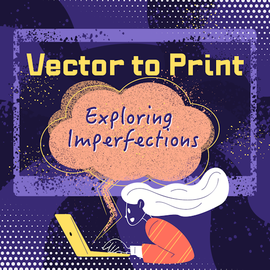
From Vector to Print: Exploring imperfection as a powerful attribute
8 minute readWritten by: Jennifer Hanson
To many, perfectionism can seem like a virtue when the primary concern is a successful end product. However, striving for perfectionism can often result in repercussions such as feelings of disappointment, discontent, anxiety, and even taking more time to complete tasks, according to a Harvard Summer School blog post by writer Jessica A. Kent. For creatives, leaning into imperfection can result in a desired effect, whether the design’s focus revolves around an old-school grunge aesthetic or the use of a bit of traditional or classic texture. Opting to embrace the imperfect with the help of various Illustrator plugins can result in surprising advantages that range from relatability to a heightened level of character — especially when taking vector designs to print.
The value of intentional textured effects
It can often appear as though everyone is striving for perfect, smooth, and polished results, especially in the newfound era of artificial intelligence (AI). However, a vintage design can be visually appealing for many, with effects ranging from tattered to distressed to any form of texture that adds depth to a piece. Choosing to embrace purposeful texture and depth when converting a vector file to print, for instance, lets authenticity and creativity shine through. This can also be a fantastic way to achieve a specific visual outcome, whether it be a stippled effect, old-school graphic, or comic book look.
The Illustrator Phantasm Plugin is just one option for artists that wish to apply unique details that align with an “imperfect” visual appeal. This plugin includes features like scalable vector halftones, in which a layer of dots can be laid down before the creation of the primary drawing for an old-fashioned ‘popped’ comic book effect. Vector halftone specific features allow the artist to manipulate the effect in a number of different ways, from adjusting the grid angle, dpi, and even transforming the dots into another shape altogether. Other features of the Phantasm Plugin include the Phantasm Panel, where further adjustments can lend themselves to an intentionally worn look — among several settings include the hue and saturation, contrast, and the temperature or tint. The Phantasm Panel can be especially ideal when recoloring artwork with the specific goal of achieving an older or worn look through hue alone.
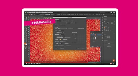
When it’s time to convert a vector file to print, preserving intentional distressing, stippling, and other “imperfect effects” can sound nearly impossible, though there are several tutorials out there that can help achieve the desired effect in a simple way. For a stippled look (which can mimic the imperfect nature of traditional printmaking and older graphic design styles), the Stipplism plugin is perfect. Allowing artists to integrate a stippled pattern to both vectors and text, the plugin cuts out the time-consuming job of individually placing dots while providing a creative avenue that enables adjustments in regard to (imperfect) precision. Stipple brushes can also be applied via live effect, further enabling artists to breathe life into an imperfectly perfect design.
Both the Phantasm and Stipplism plugins can be of great use when applied to techniques found in common tutorials, which walk through how to achieve specific results. For example, an Adobe Illustrator tutorial article details how one can achieve a distressed effect on a graphic through the application of “traced texture as an opacity mask.” In regard to the image that features the desired texture (an adobe stock image for the sake of the tutorial), the video narrator states: “you’ll trace it to convert it to vector artwork, so it can be edited and resized easily without losing quality.” This process may require various adjustments to the tracing in order to retain the finer details of the texture, in which various options can allow for differing levels of detail to be traced. For example, in the Trace panel, the option “Corners” can determine how the corners of the texture will appear (smooth or sharp, the article notes). After making the desired adjustments, the opacity mask feature can then be edited to the desired effects for the project at hand.
Old-school grunge
Achieving an old-school “grungy” look can also be achieved to create a design that achieves an ink-bleed effect on featured text, whether the project is a poster with a vintage look or a particularly snazzy business card. A YouTube tutorial by creator Louis Moss walks viewers through a tutorial on Adobe Photoshop, which involves starting off with a clean, simple text in the middle of a white background. After applying a blur effect to the text, Moss makes adjustments (such as a ‘ripple’) that serve to play with the edges of the text for a ‘bleeding’ effect. From there, Moss advises the application of a displacement map, which he notes is particularly important. “What a displacement map does is it allows the text or the graphic or whatever you’ve got to sort of take the shape of the map that’s below it.” After adding in a separate document that features a roughed-up texture (ideally with plenty of contrast), it can then be selected as the displacement map for the first text-focused document.
Various Illustrator plugins can help to achieve the right old-school grunge appearance, depending on the artists’ vision. The unique texture of crumpled paper is just one fantastic example that can appear in the realm of grunge graphic designs, especially when layered with uneven text and purposefully patchy graphic overlays. Whether used with a displacement map technique, stock texture image, or a painstakingly hand drawn textured image, the Texturino Plugin is particularly ideal for this type of project when the goal is to accentuate the underlying texture with a specific, detailed effect, with helpful tools that range from the Opacity Brush to the Texture Brush. The included texture brush tool, for example, can help achieve the particular contrasts on vector images that mimic the grooves and creases of a crumpled paper effect through the smart placement of shading, shadows, and highlights where appropriate.
The varied results of manual processes
Imperfections in design can also arise when the translation from vector image to physical product is performed manually, which can render results based on the manual vectorization or tracing process used. For example, a vector design that needs to be manually brought to life into a physical product may involve crafting, which involves plenty of potential for error in the realm of finished design. Metal hand stamping is just one process that many may turn to when creating personalized metal designs like jewelry or keepsakes, and may involve using the original digital design image as a guide throughout the process. While tools like the Texurino Plugin are ideal for the creation of weathered and worn effects in Illustrator, translating such digital imperfections to the real world can be another concept where an additional layer of creativity is needed.
Purposeful imperfections can be preserved via a variety of manual vectorization techniques. For example, a weathered appearance is just one look that can be attained through special techniques and tools for an “antiqued” outcome in the realm of metalworking. In metalworking, the finished product can often rely on skill, though even the supplies used can influence the finished product. For instance, the type of materials used in metal stamping can yield differing results, which may produce a favorable ‘mistake’ should a craftsman use a metal that brings unexpected impressions. While the process may appear controlled (simply reference the vector design whilst creating), human error is always possible and can result in mistakes that bring a new level of character to the product. Text misalignments, misspellings, or design flaws (like double impressions) can all bring an authentic, handmade feel to a product that the right consumer will appreciate, even when it doesn’t closely resemble the original vector image.
An imperfect design can be a great way to embrace a unique look, especially in an era where everything seems overly polished to perfection. Whether it’s a distressed, antique, or old school effect, successfully maintaining a desired look throughout the vector to print process doesn’t have to be an impossible feat.