10 tips to take your logo design branding to the next level
12 minute readTake your brand to the next level by reading our top 10 list of things to consider when designing a logo. Learn tips and tricks to inspire you and help you work better and faster as a designer. From choosing fonts to filling that negative space, help your logo paint a thousand words for your brand.
1. Think big
What’s the logo for, where will it be going? These are important questions for the client before you start.
Logo Geek has got some great free advice on how you can create a research and design brief questionnaire for your clients. Asking them to fill out a simple data gathering form will help you understand their business, products, services and its target audience.
2. Consider color psychology
Don’t overdo color. Start designing your logo as a black and white object.
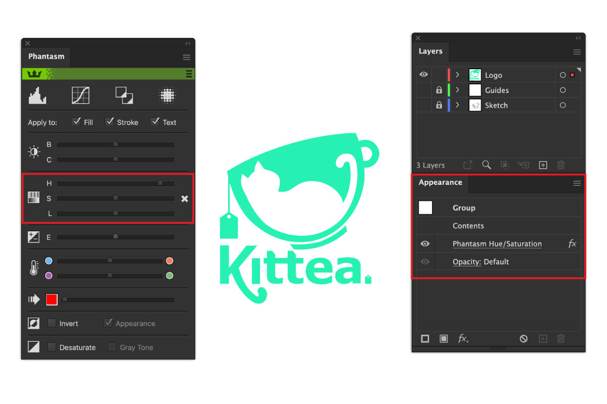
When you’re ready to add some color the Just Creative’s color guide helps you understand the meaning behind colors to help get you started. We recommend using the Phantasm plugin to experiment with color levels and hues. The Phantasm options are added as non-destructive live effects which means you can easily turn them off or expand them when you want to commit any changes.
3. Typeface is important
The type you choose can convey different messages about your brand to your audience and No.comic.sans.ever
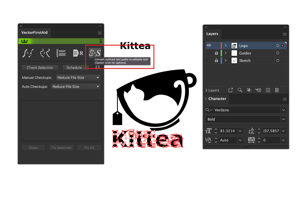
There are many places to source free fonts on the web, but always consider using a web safe font to begin with. This gives the clients a base they may want to work from for other branding material (menus, website, brochures etc). When creating your logo always keep a note of the font you used, you’d be surprised how often you may need to refer back to it. If you have outlined your font, you can use the Unoutline Font option within VectorFirstAid to convert it back to editable text. As long as that font exists in your computer system, VectorFirstAid will find it.
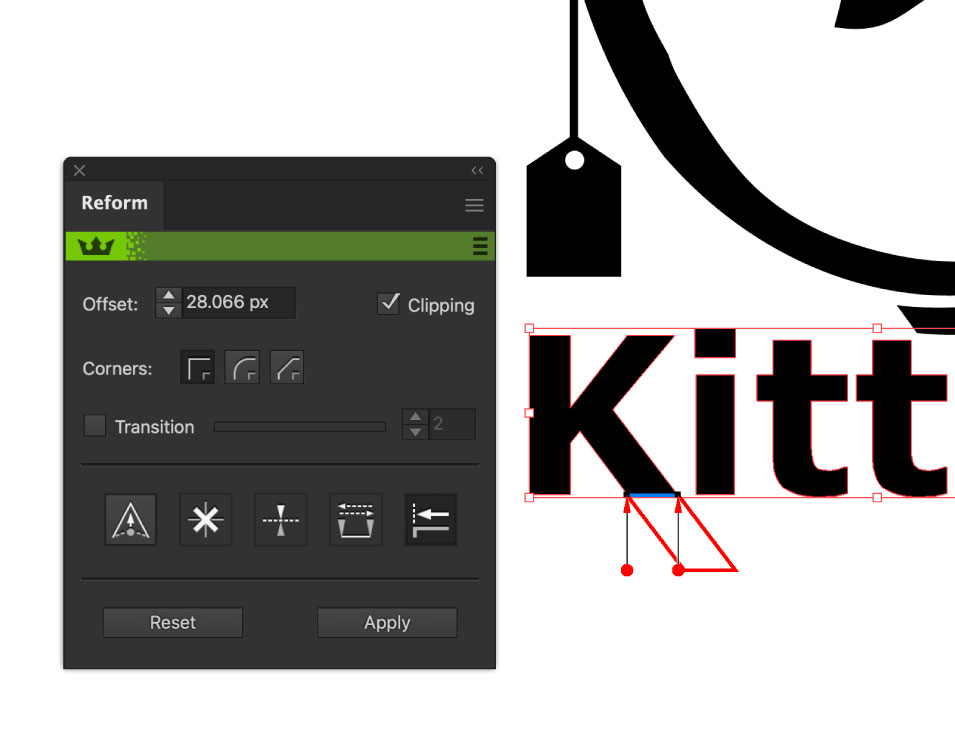
If you want to add extra details to your outlined text you must try out the Reform plugin. Reform allows you to sculpt paths without using Beziér handles. Reform can even constantly offset paths with a smart join function, allowing you to easily thicken or extend segments accurately.
4. Responsive logo
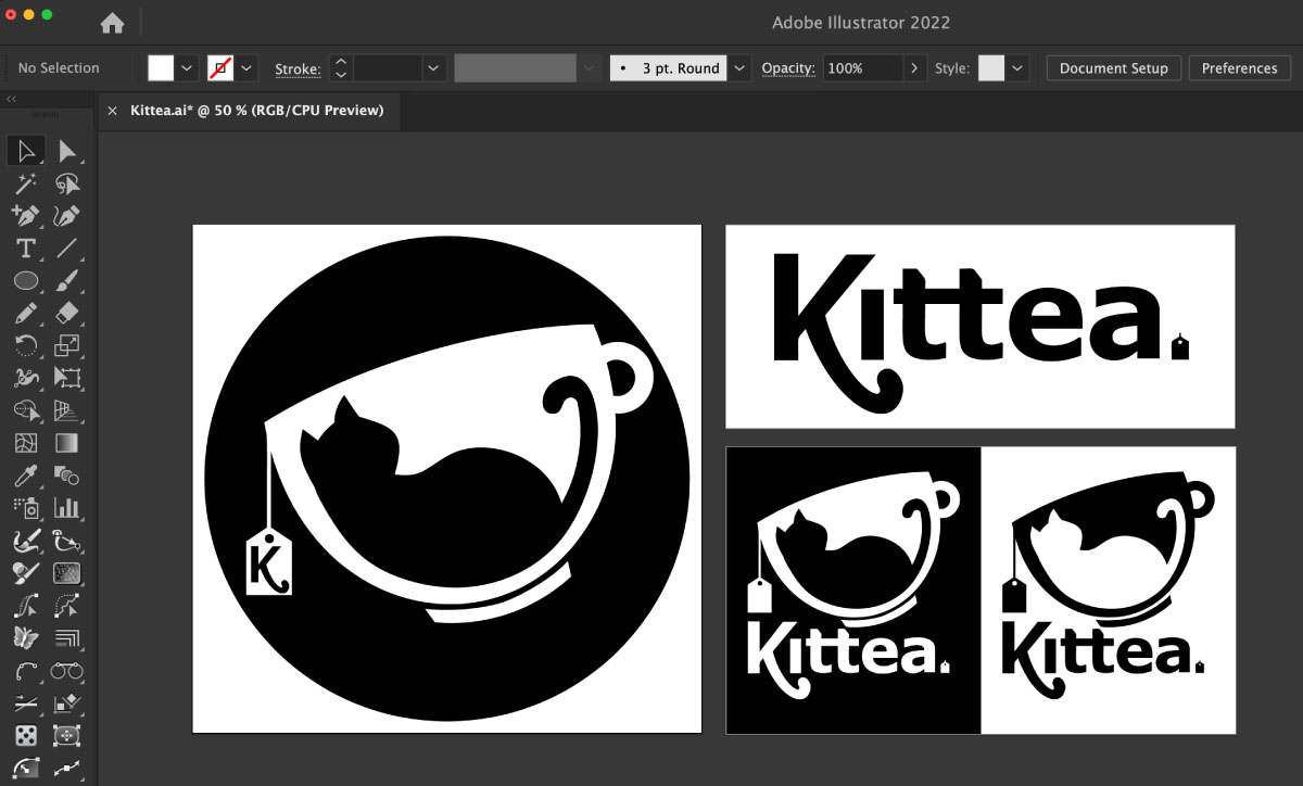
What is a responsive logo? Responsive logos are adaptable, without losing their brand identity. A logo now needs to work on dark and light backgrounds, in mobile web menus, in square formats and be easily recognisable in social media profile pictures. But don’t try to make it all at once. Create several artboards, or even go back to sketching out different formats on paper. Just remember what is the key identity you’re trying to build with this logo, and when reduced right down, what part of the logo could it never live without.
5. Finessing fonts
Once you have chosen your brand font try and add some personality.
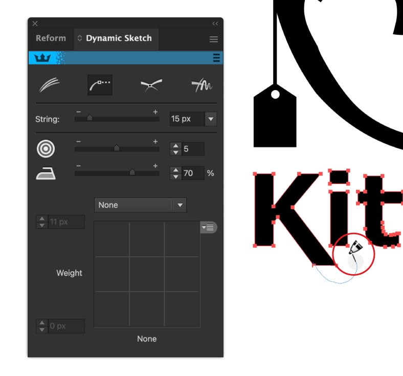
Like we mentioned in point 3, always keep a note of the font you’ve used before you outline it! You never know when you need to start again. DynamicSketch allows you to continue editing a path, like the native Illustrator pencil tool, but DynamicSketch has a few extra bonus features including the easy to reach panel which has sliders for accuracy and smoothness. It also has a string feature which pulls the cursor along. This is a great help when tracing over an image, and allows you to intuitively sketch, being smooth when you need it to, but also creating sharp corners with a tug.
Making sure your curves are smooth and your corners are pointy is going to elevate your logo and make it look effortless. The AG Curvature Visualizer (part of the Stylism plugin) is a live effect that visually shows you the curves with an overlaying gradient. And as it’s a live effect it won’t affect your original path and it is easily hidden or removed. But it’s a great guide to help you make fine adjustments to your anchor points and handles to make aesthetically pleasing curves. This quick tip video shows you the basics.
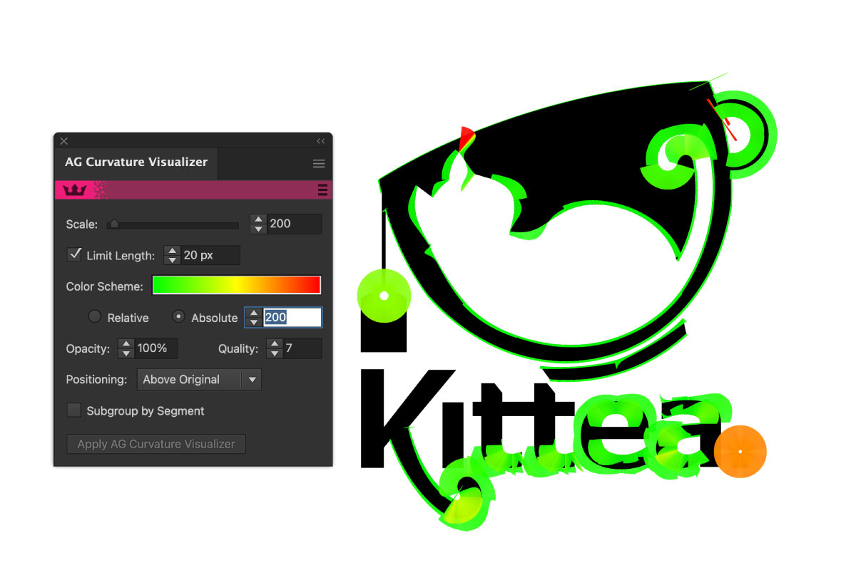
What is a curvature visualizer? A curvature visualizer allows designers to render how tight their Beziér curves are, and if there are any abrupt transitions between segments. Astute Graphics' Curvature Visualizer was specifically developed with glyph and logo designers in mind.
6. Easy on the effects
Less is more! Go easy on lots of effects.
When it comes to adding effects think about the future. For example, gradients and drop shadows can go out of fashion, so stick to simple shapes when you’re designing a logo. There are many popular logos which have evolved over time to make them simpler, timeless and yet still recognisable. One of the most famous logo and brand redesigns is Pentagram’s redesign of the Mastercard logo. Reducing the shape down and ditching the name, Mastercard’s logo is still recognisable all over the world. And Pentagram’s portfolio shows how the logo can be used in different formats, and in greyscale and yet not lose its identity.
7. Think vector
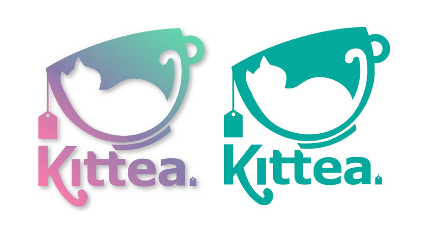
Think vector when it comes to logo design. Not only are you going to be restyling these logos for different size formats, it all needs to be scalable. Sketching logos is a great start, whether you use pen and paper or a drawing tablet, but you will need to convert this into a vector to have full control over it.
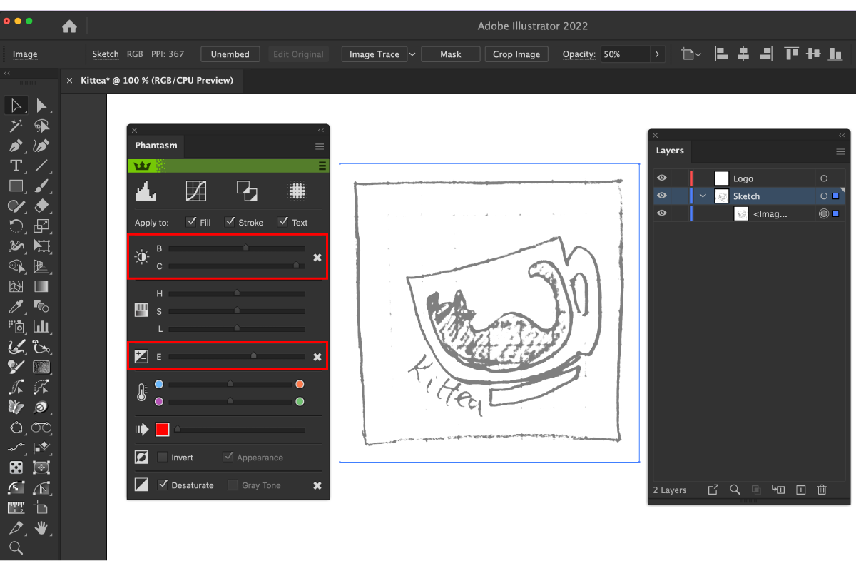
How do you convert a sketch into a vector? Take a photo of your sketch and bring it into Adobe Illustrator. Embed the image onto your artboard in its own layer, and using the Phantasm plugin you can increase the brightness and contrast to reduce it to a clear outline. Reduce the opacity of the image to 50% and lock the layer.
Next use guides to mark out the key areas and start to redraw using basic shapes. Circles and ellipses are a great start, but also think about arcs. Arcs aren’t the easiest thing to make in Illustrator accurately, and the native Arc tool isn’t the easiest thing to use. Try out the Arc by Points tool (part of the Subscribe plugin). You click once for your starter point, twice for your end point, and then you can drag up your arc using the centre target preview marker as a guide. It will also snap to guides, grids and auto-join to open paths.
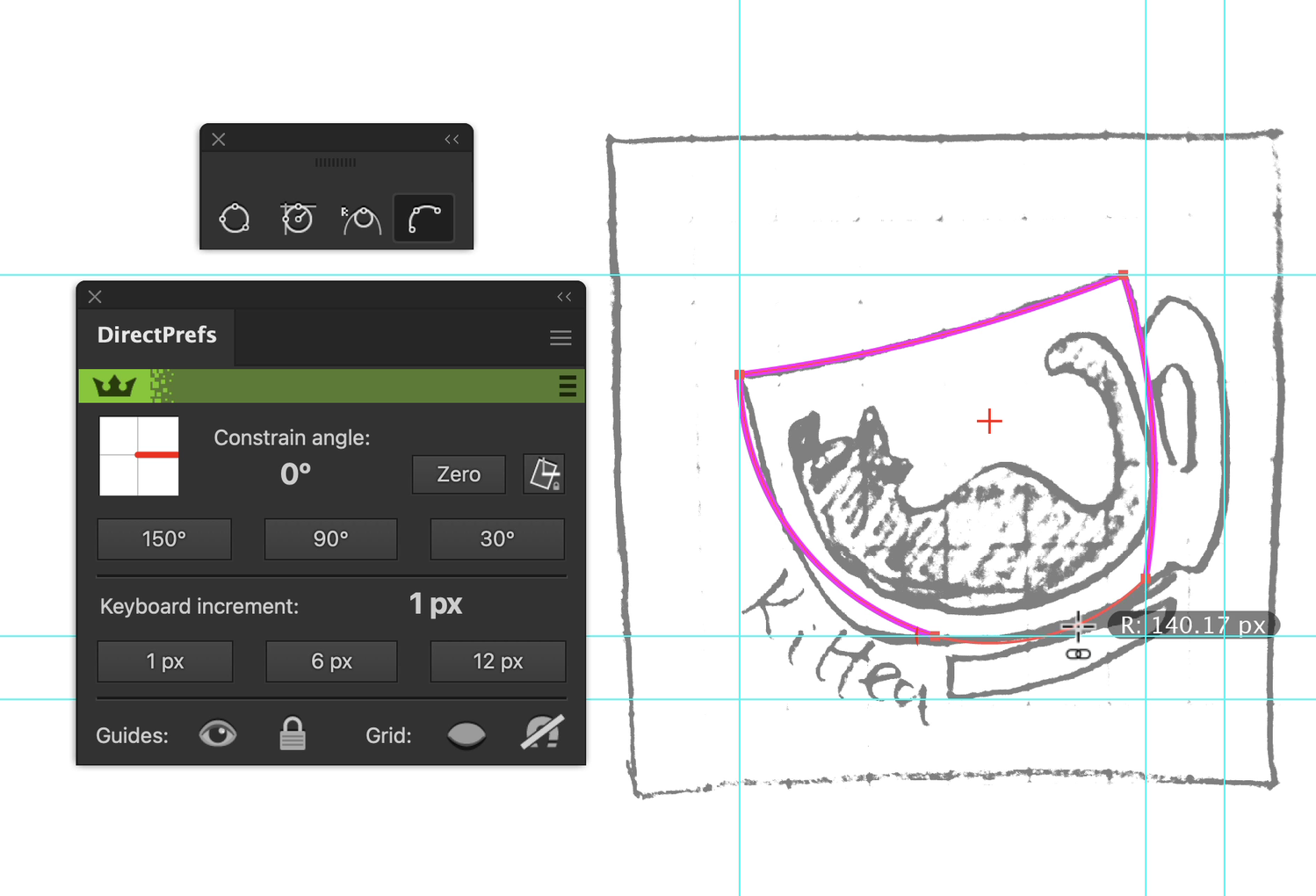
How do you quickly hide guides and grids in Illustrator? The DirectPrefs plugin is free, and the panel has easy to reach buttons for hiding, showing, locking and snapping to guides and grids in Adobe Illustrator.
8. Don't forget white space
What is logo negative space? White or negative space gives a logo balance and clarity. It can also act as another element without crowding, and gives you the opportunity to add hidden elements. If you are going to add something into your logo’s negative space, then make it relevant! It’s a nice to have, not an essential trick of the eye. Digital Synopsis have collected 51 creative logos that use negative space brilliantly to inspire you.
If a logo is to be printed on anything, then that negative space needs to be empty. Once you have your logo, put a randomly colored shape behind it and make sure you have nothing out of place. Illustrator’s Pathfinder and Shape Builder tools are great for dividing and intersecting paths. Tony Harmer, aka the Design Ninja, has a great quick tip video explaining the Shape Builder tool.
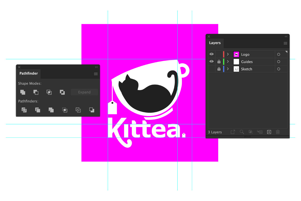
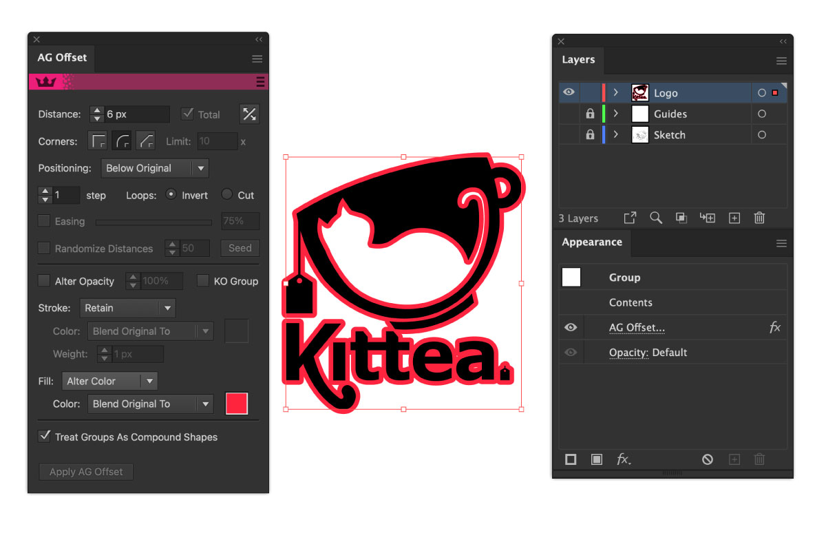
How do you get the negative outline around a logo? Sometimes adding a stroke around shapes won’t work, or duplicating and expanding your objects is time consuming and fiddly. The AG Offset Tool (part of the Stylism plugin) can create offsets around groups of objects which you can then use to minus from your logo.
9. Don't be afraid to reinvent the wheel
It’s ok to be bold and try new things. Use patterns, overlapping shapes, and contrasting colors to create a modern logo.
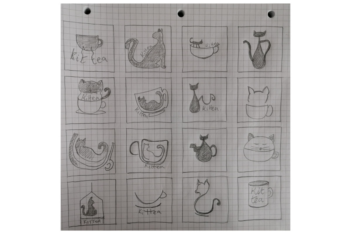
It all comes back to that initial sketching phase of a logo design. A great way to start this process is with a blank piece of paper. Fill it with any idea. Don’t take too much time, just sketch out all your thoughts, and don’t stop till the paper is filled.
Now walk away from it, have a cup of tea, and come back with fresh eyes. What stands out? What are you drawn to? Can you slowly look at each one, maybe hide the others and see what it says to you. Maybe you can take a photo of each one and scan through the gallery? Can you still see a brand identity? When you’ve whittled it down to a few choices then get second opinions. Can friends tell what this business is about from what you’ve drawn? Is it obvious what the company does? You can do this process as many times as you like, getting more elaborate, or even simplifying the shapes right down each time, to really hone in on what you’re trying to convey to your audience.
10. Keep it simple, keep it clean
The more simple a logo is, the more recognisable it will be. And perfectly placed points are going to add that extra level of detail you didn’t know you needed.
What is the clockwork method of graphic design? The clockwork method (TCM) is placing your anchor points at 12, 3, 6 and 9 on a clock face as you look at it. Or also known as the North, South, East, and West points. Using guides you can mark out the outermost (extremum) points of your design and reposition points to be best placed. Logo designer Will Paterson has made a super simple Instagram reel explaining this.
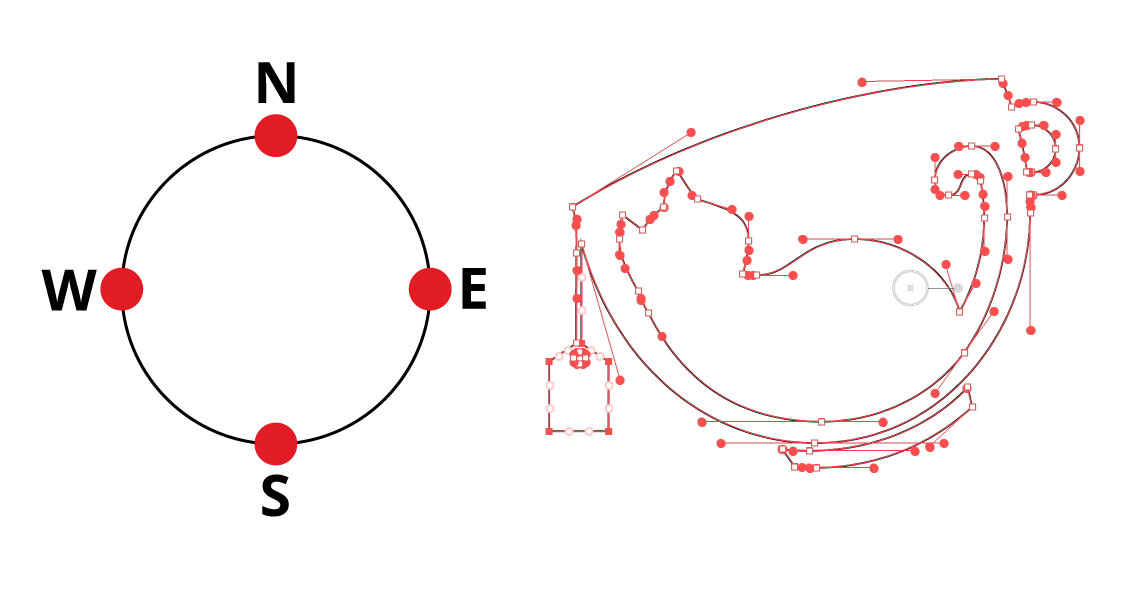
The Reposition tool (part of the VectorScribe plugin) does just that, it allows you to drag single, or multiple points around your path without altering its shape, and snapping to the cleanest geometric positioning.
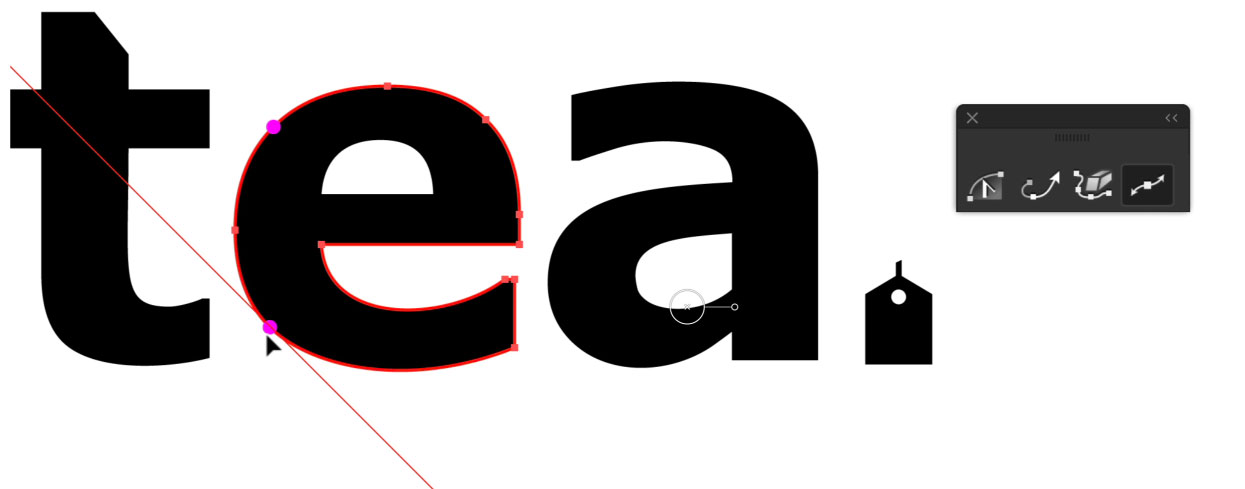
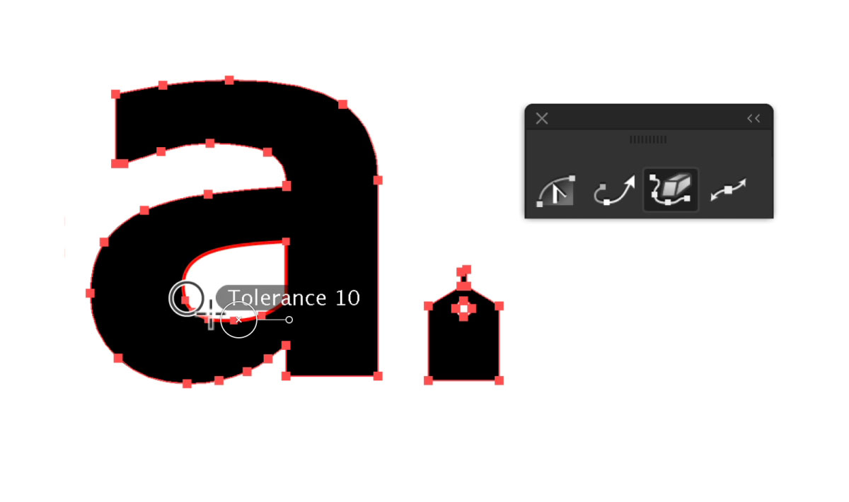
The Smart Remove Brush Tool (part of VectorScribe plugin) is such a quick and handy tool for cleaning up your vector shapes. The native Illustrator Simplify menu option can alter or shift your original shape, whereas the Smart Remove Brush tool only leaves behind the best placed points without altering the original path. You can read and watch the video on our quick start guide to the Smart Remove Brush tool here.
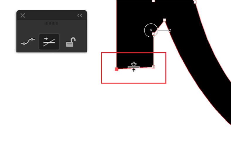
The Straighten tool (part of the Subscribe plugin) does what it says on the tin... it straightens. Ideal for ensuring all your edges are perfectly square and nothing has shifted. You just run the tool on the edge of your shape and click to straighten. No need to have the object selected, you can watch a quick tip video of how it works here.
These tools where chosen by Aaron Draplin, of Draplin Designs Co, as his Top 5 Astute Graphics Tools for making him a better and smarter designer.
